@Menglor I wonder if some of the annoyance stems from how the UI displays on your setup, Stephen. (Not a shot, just a curiosity. )
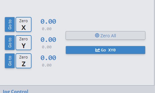
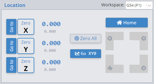
On my Win10 machine, here is how the buttons display:
Now, the zero buttons are still much larger than the goto buttons. But the layout is more clear. Also, the colour scheme follows the scheme of the two large buttons for zero all and go xy0.
All that said, one reason why the current layout may not bother me is that, more often than not, I am using a wireless keypad to perform both the “set 0” and the “goto 0” functions.
With luck, some others will jump in to add their voices to this layout question.
We’ve made some visual tweaks to this area in the next version to make the buttons more visually consistent with the rest of the buttons in the UI so hopefully it clears it up. I can understand that GoTo can look more like a label than a button so we’ve taken steps to have both act and look closer to other UI elements.
For now we’ll likely keep the order of the buttons the same.
We’ll likely evaluate this area furtherin a later build, but generally setting axis zero tends to be the more prominent action over GoTo in other senders, as shown below:
Openbuilds:
UGS:
BCNC:
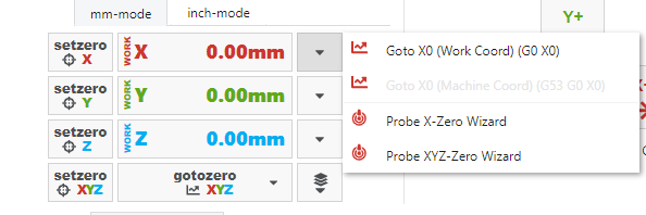
gSender:
While I personally agree that GoTo has a higher chance of being used multiple times over setting an axis, we haven’t received enough feedback one way or another to make us want to swap the priority of these buttons. Also, consistency with what users expect from other senders for basic functionality is pretty important to us and helps make the platform less of a learning curve, so keeping set more prominent than goto seems to be the move for now.
 )
)