This will likely be a long project since I’m working on it in between others.
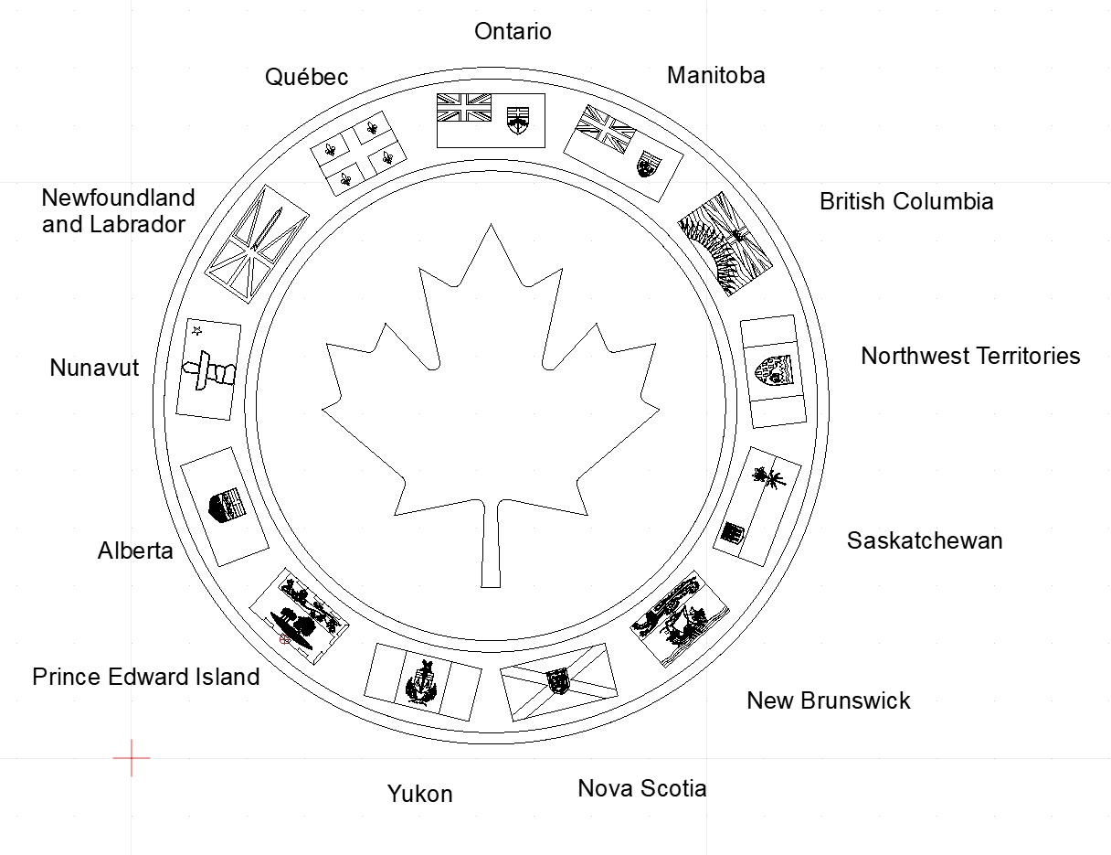
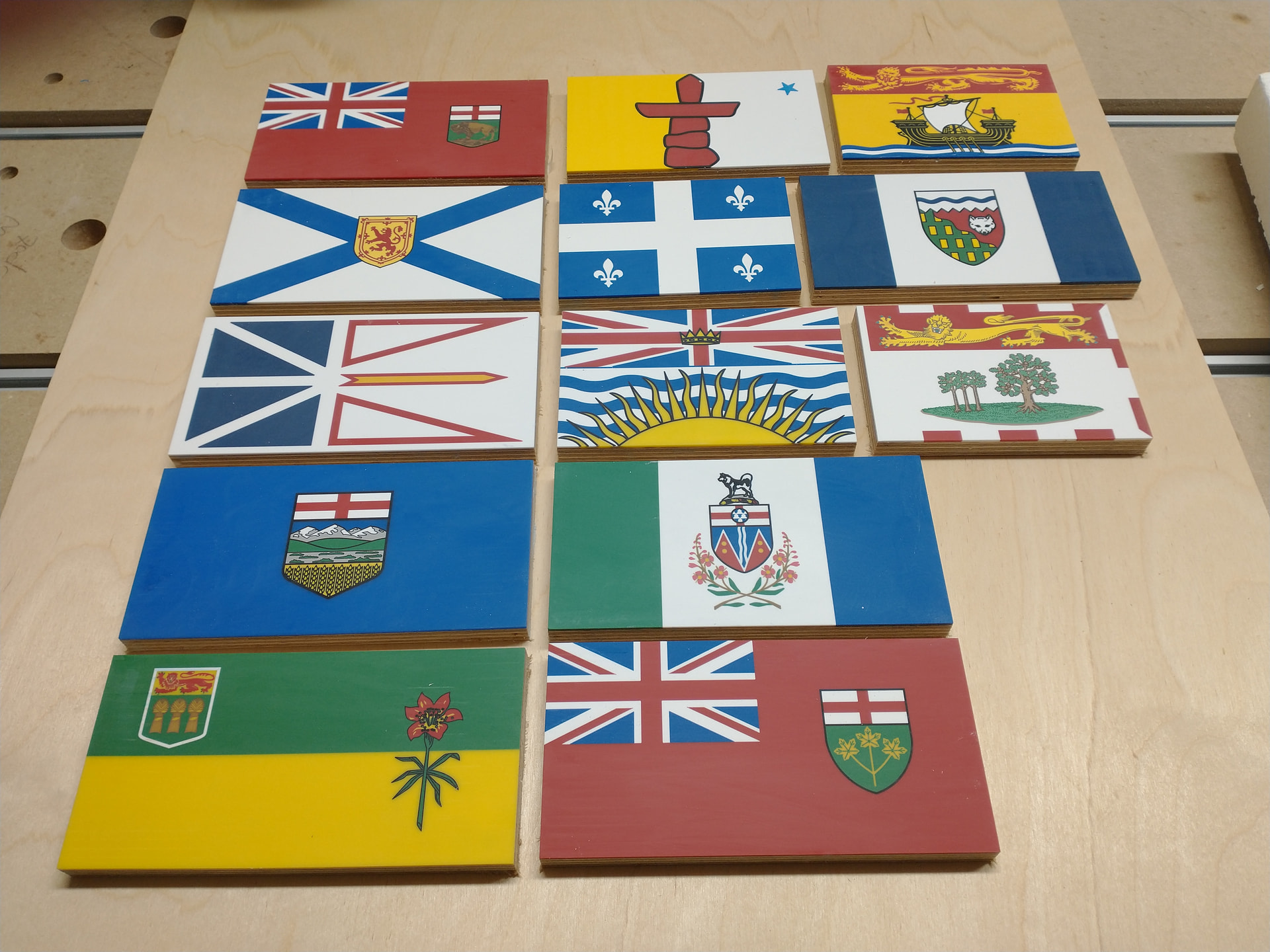
One of the first thing I wanted to do when I ordered my Altmill was a set of Canadian provincial and territorial flags arranged on a medallion about 36" in diameter.
While waiting for the Altmill, I did the files for all the flags and arranged them around a red maple leaf. The provincial flags are small, about 3" x 4" so the level of detail I have in the files will need to be reduced depending on the quality of the carve.
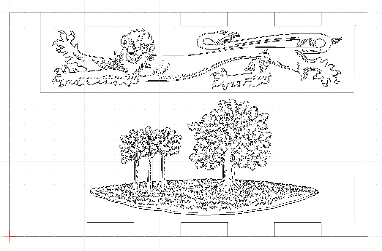
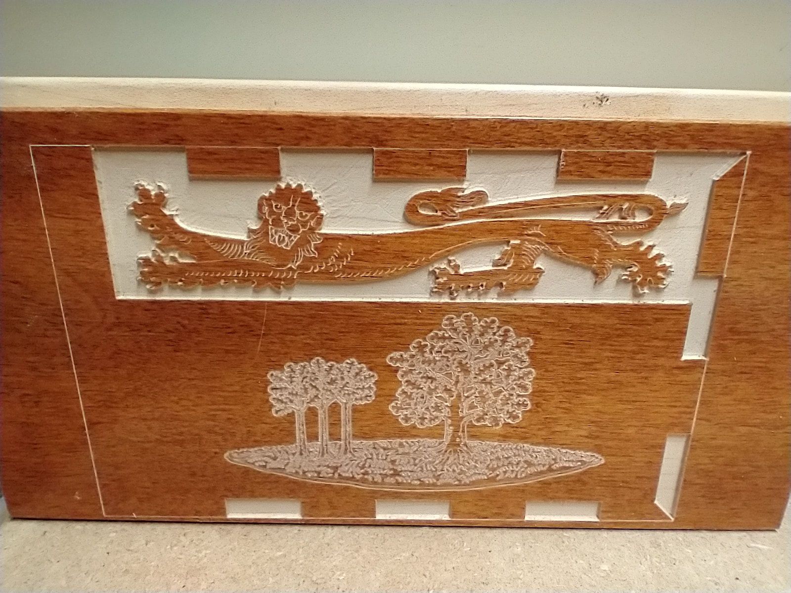
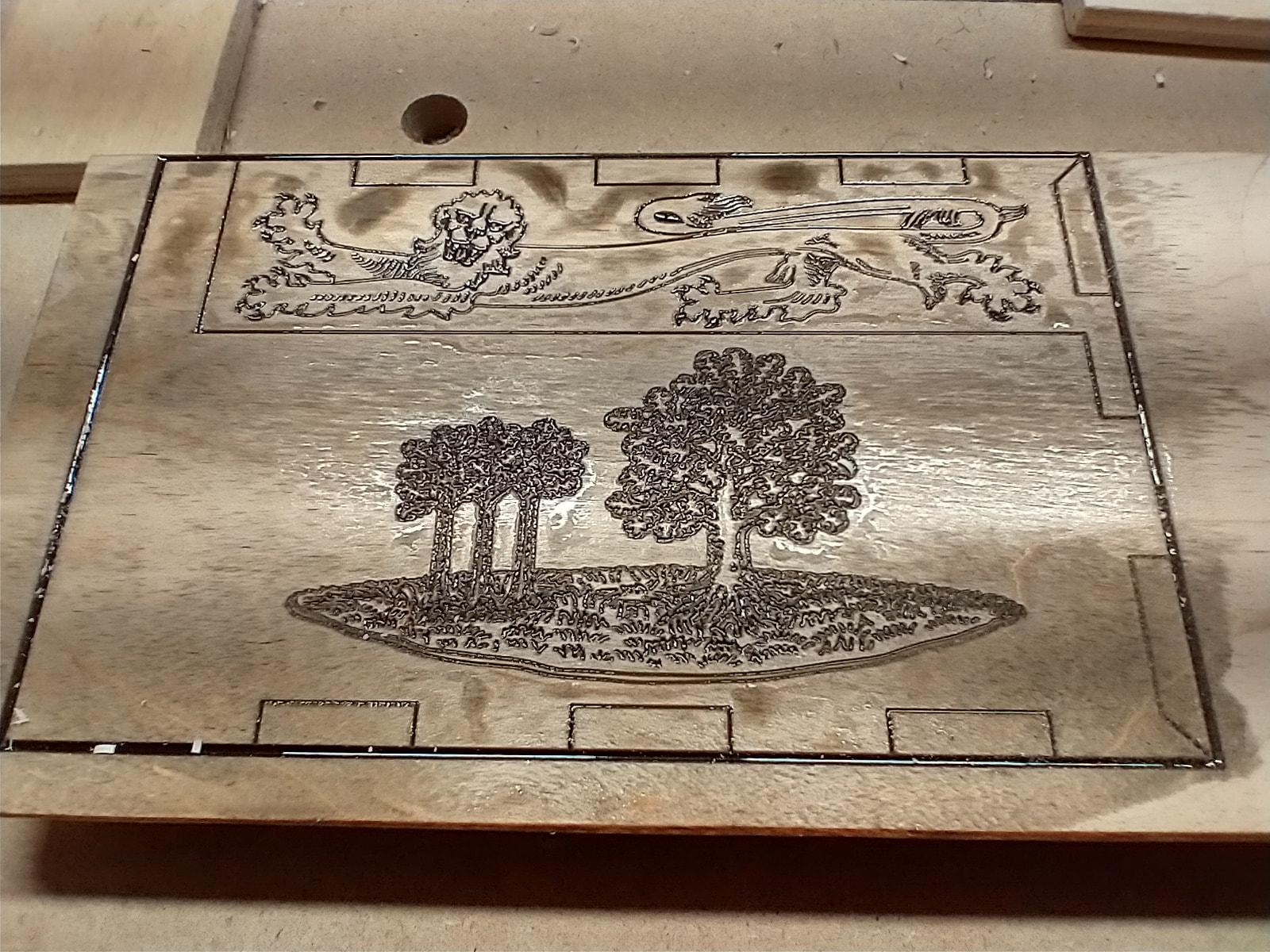
I’m currently working on the flag for PEI. It has a lot of very fine detail, so choosing the correct tools and removing some of the finer details will be required. I suspect some trial and error will be required.
I carved the flag on a piece of maple hardwood flooring. I didn’t surface it before so it probably wasn’t entirely flat. I think I’ll make the recess 0.5mm instead of the 1mm I have now. And I hope to make the grooves inside the lion and the trees a bit deeper. Currently using a 60° v-bit for those
The second is with a pocket cut of the parts that are in red on the actual flag. Pocket is then filled with black epoxy. Never mind the bleeding. As this was a test only, I didn’t bother sealing first.
I like the look of the pocket one as well. It really pops!
I think this is a cool project and I look forward to seeing how it progresses. If fifty flags with enough detail to be readable would fit in an average sized room I might be tempted to do one for the USA.
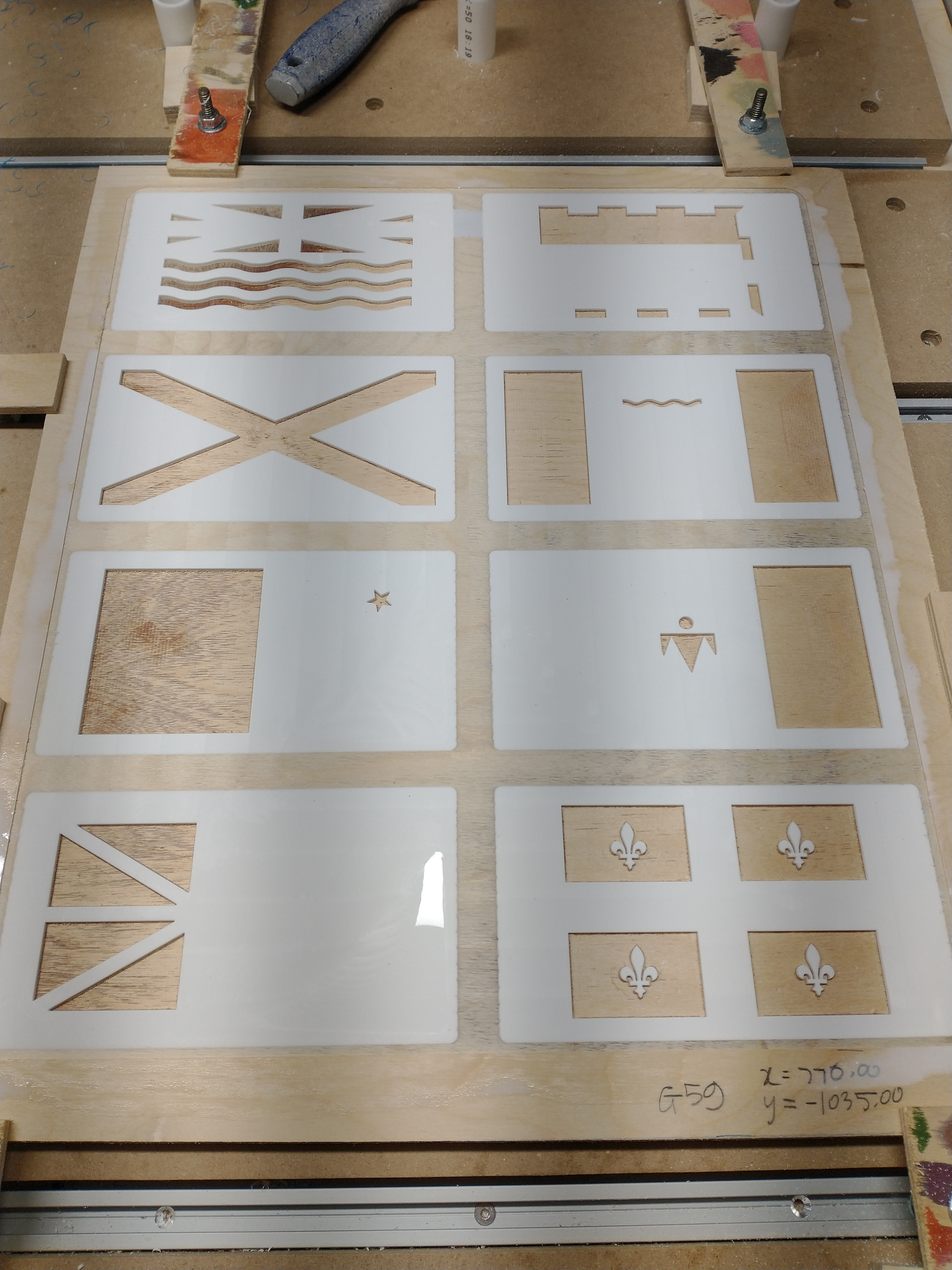
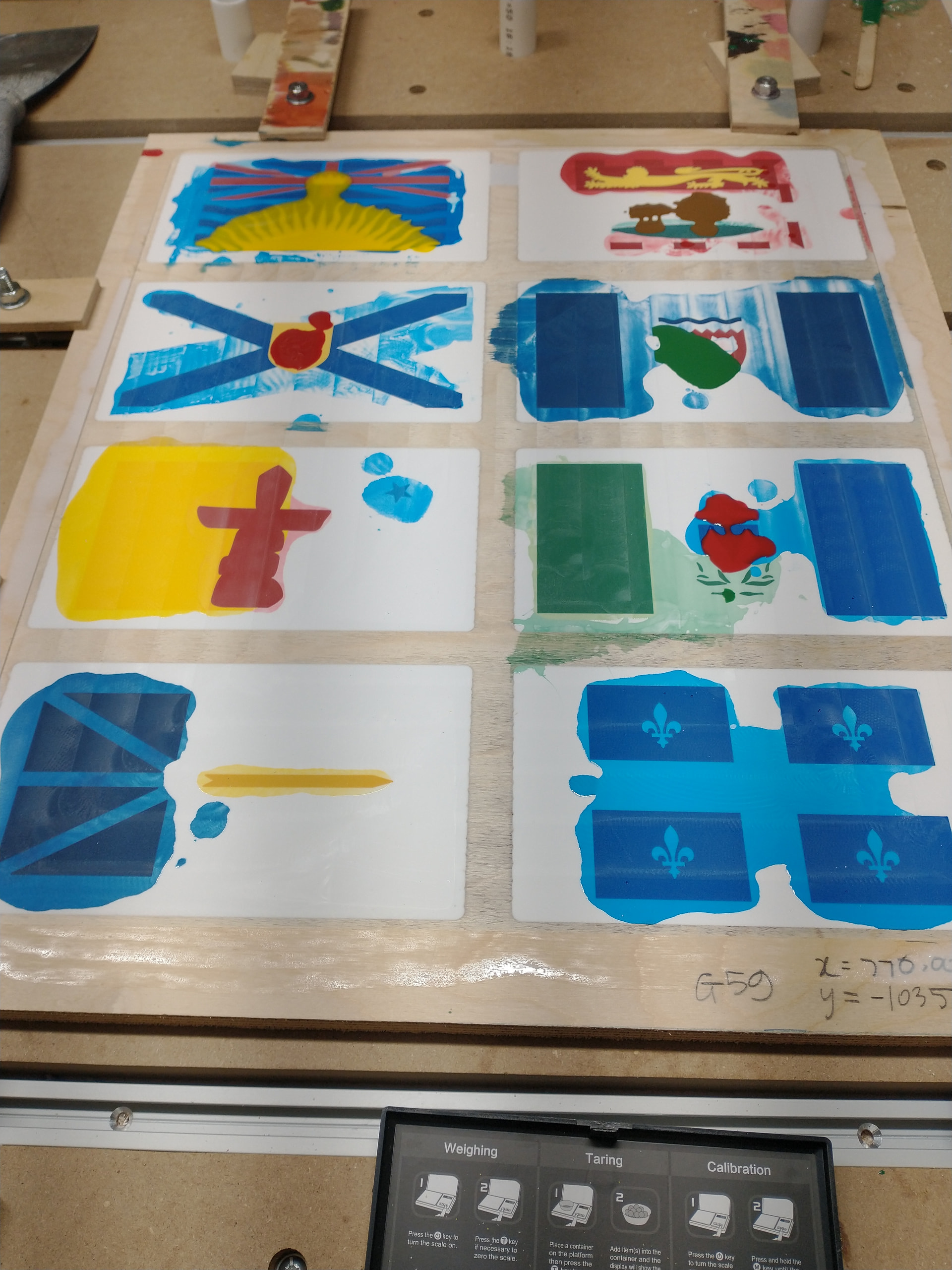
Because there is a lot of curing time to wait in between epoxy pours, I am doing them in two batches. The first batch of eight will comprise the flags with a high proportion of white for the field. The picture below is of the white epoxy layer with the first pocket carve that I’m about to fill with coloured epoxy. Some flags only require one colour. Others will need to be done in multiple steps, via a combination of pocket cuts of v-carves.
Colours will be approximations as all I have are blue, red, yellow, white, and black pigments. And while I have the Pantone or RGB code for most of the colours, there’s not really a RYB equivalent. I have a colour wheel and will work with that to get an approximation.
I finally had a use for the different workspaces in gSender. Since a part of the mill is reserved for this project, I have a separate workspace with it’s own zeros. I can use the free space to do other small carves in the meantime.
Note to self:: do not use a surfacing bit on epoxy without using the dust shoe. I have epoxy strings all over the place.
@JPlocher Yeah, I looked there too. Might be worth trying. The problem is that none of them have pure red, blue, and yellow pigments. I have red and blue and you’d think you would be able to get violet if you mix them. But all I get is a dark purple. And that’s because the red likely has a bit of black or other color. Same as for the blue.
My daughter knows colour theory well enough to know that it’s impossible to get every colour I would want with just the five that I have.
Like I can get them close enough but they certainly won’t be a perfect match. Besides, even if I had a perfect match, lighting and the other colours nearby would affect our perception. So it might still look off.
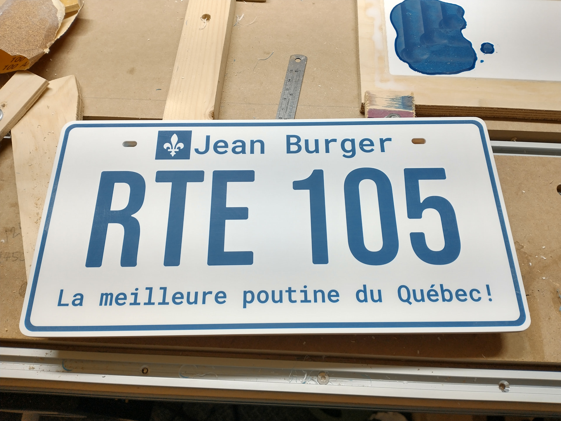
While waiting for last night’s batch of epoxy to cure properly before surfacing again, I completed this epoxy project I made for a restaurant that I frequent when going to my cottage. They have a wall of vintage license plates and I figured this would make a nice addition. It’s located on Route 105 in the province of Québec. An unsolicited gift from me to them.
Fun fact: There are a few photos of Arnold Schwarzenegger flipping burgers when he was there many years ago. I guess he was famous enough to have a photo op. Probably Conan the Barbarian era or earlier.
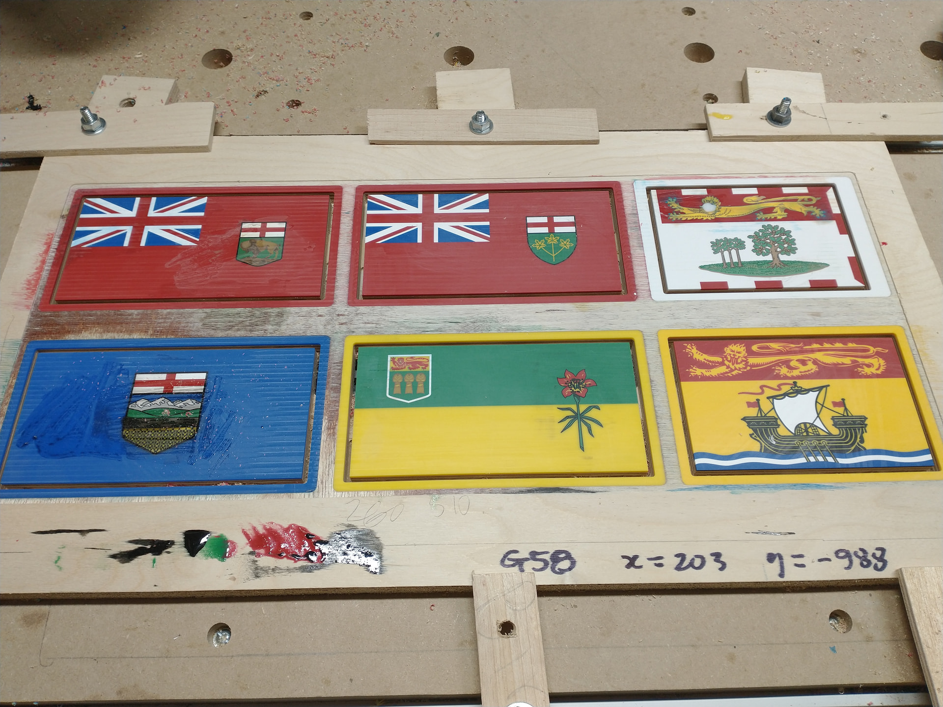
Coming along nicely. The large pockets have been done. Once this morning’s epoxy cures, I will do a final surface. Then it’s just a bunch of v-carves. Any epoxy excess in the carves will just be removed by sanding.
Colours are still hit and miss. I’m going to have to do a colour palette with the corresponding pigment proportions for any future project.
The nice thing about working with epoxy is that any screw up can just be carved away and re-poured.
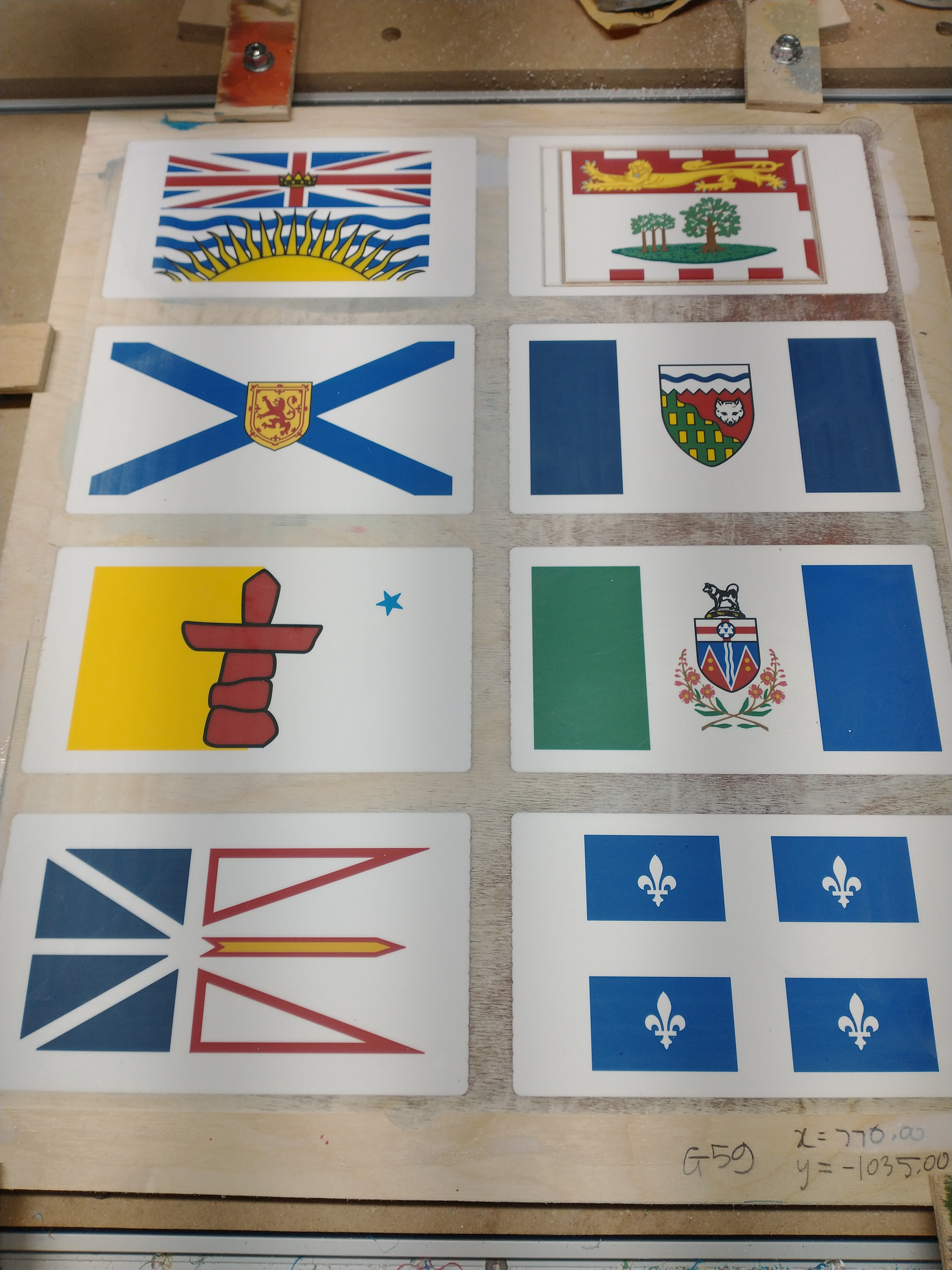
Done with the first 8 flags. I’ll cut them out and once the epoxy has cured for several days, I’ll wet sand it down to low luster. Some of the details will be more apparent as well. For example, just below the dog, there’s some red and yellow hidden by a thin layer of black. That will be sanded off.
I must say I’m impressed with the Altmill’s precision.
I removed some of the details from the carves because I thought they’d be too fine for the Altmill to carve. Maybe I should have left them in. I could out them back if I wanted to, but I’m not going to attempt it. They are small enough that they are only noticeable up close.
Now that my technique has been refined, the next 5 should go faster. The order in which the carves takes place makes a difference in the crispness of the carve. I now know what needs to be done last.
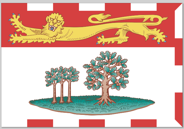
One thing that I learned is the lack of a definitive flag design for some. For example, I’ve seen several versions of the oak trees on the Prince Edward Island flag. It’s always three on the left and one on the right, but how the leaves look change from one flag to the next. The Manitoba flag, which I haven’t done yet, sometimes has a crest with a rounded bottom, sometimes with a square bottom. The provincial website shows both versions in different locations on the site. So who knows which is the right one! Ultimately it’s not that important.
Wikipedia is where I got the SVG for most, if not all, the flags. But I also cross reference with other sources just in case. In Manitoba’s case, even their government web site shows both versions.
Ultimately, I decided to use the rounded escutcheon that is also on their Coat of Arms and on the government of Canada’s web site.
Cool, I was able to find the exact proportions for every element of the Stars and Stripes so I thought I’d do a quick search. Flags often have a rich history so I think its cool to read about them. Finding out about all 50 states would likely prove much harder.
@_Michael another example of a discrepancy is the Prince Edward Island flag at the top right. I mentionned the oak trees before but there’s also the white space at the left of the flag. Some versions have it, others don’t. But if I look at the version on the PEI government web site and I want to maintain the 2:3 ratio of the flag, the white space needs to be there.
These flags all existed before digitization. Which probably explains why different versions exist. Until the respective governments publish the official e-version of their flag - an SVG file and not just a bitmap - then the actual version is probably up for debate.
Try to find the red colour of Canada’s flag… It’s not a Pantone colour but rather a long winded scientific description based on reflectance, colour absorption, and other parameters. It might be fine for people who need to reproduce the flag, but come on, just tell me it’s scarlett, lol.
@gwilki Yeah, I was aware of that source. And a few others that gave different codes but ultimately gave similar reds. But this eventually led me to do more research. As @_Michael stated, there’s a long history for these flags and it’s interesting to learn more about it.
It’s not a Pantone colour, a RYB code, RGB code, or a CMYK code. But rather a CEILAB L.a.b code that nobody cares about. But really, it’s all irrelevant. Sometimes close enough is good enough. For me, it’s the red pigment that I have with a bit of black added to it.
Just completed the remaining 5 flags. Actually, I had spot for an extra flag so I re-did the one for PEI with some additional detail. Now that they’ve all been cut out, I will sand the epoxy with wet/dry sand paper to a low shine.
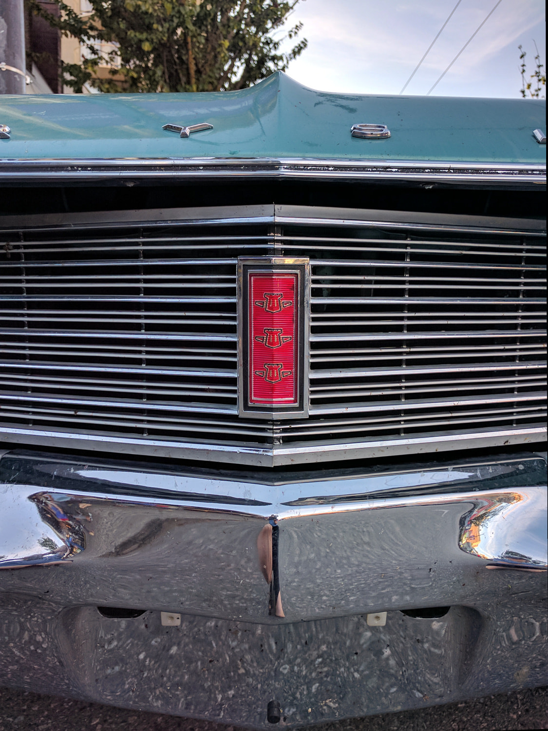
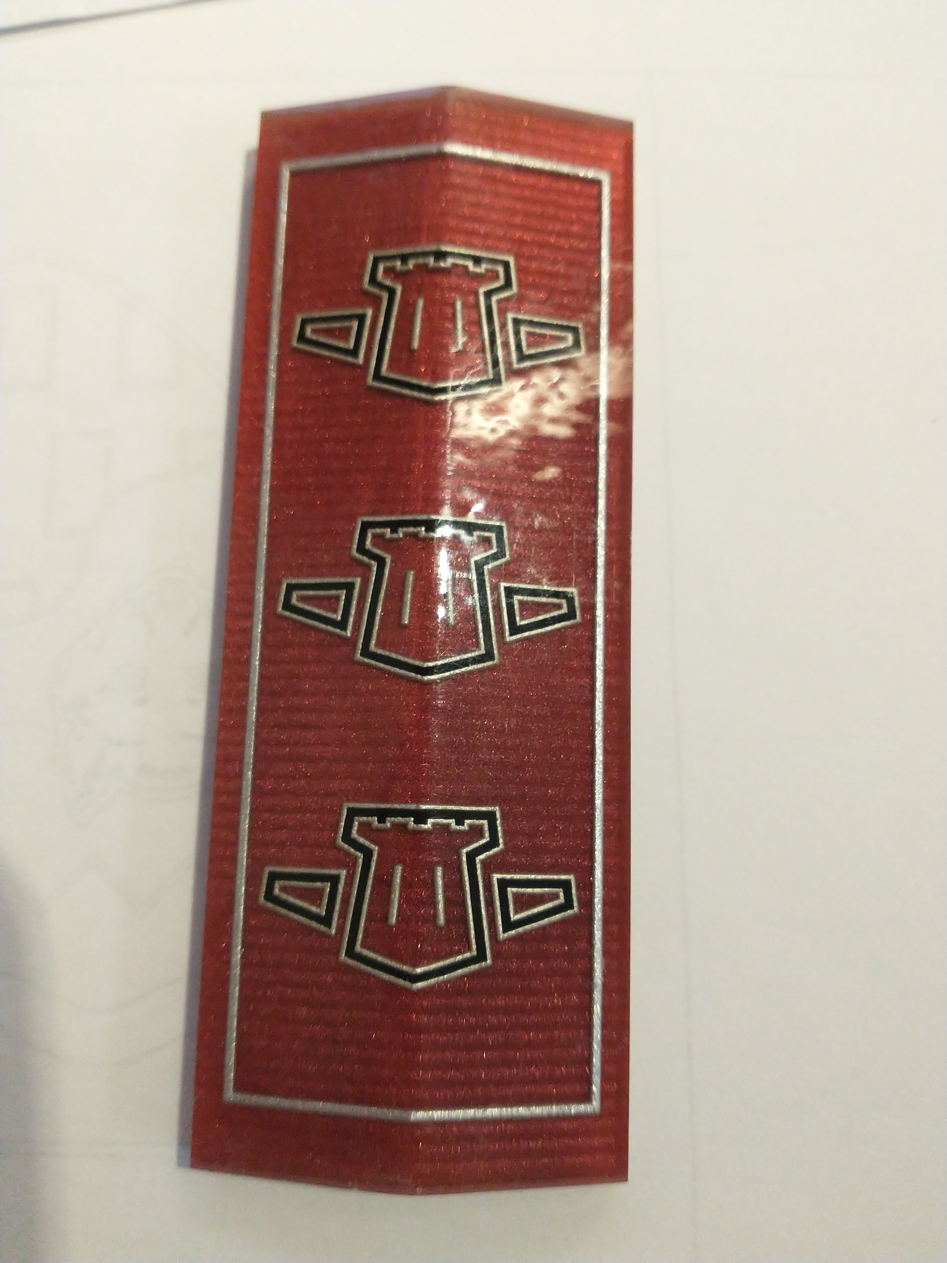
I was sidetracked a bit during the Christmas break. I’m not a car guy, but the father of my daughter’s boyfriend is. He has a 1968 Chrysler Newport. The grill emblem on those things tended to crack and they’re impossible to find (used or NOS). We were chatting about plans during his retirement and he mentioned trying to make a replica of the emblem. He wasn’t sure how to approach it, especially on painting the lines for the towers. Long story short, I told him I could probably do it on my CNC. And since I was using epoxy for my flags, I could see what I could do with epoxy. Anyways, it turned out pretty good.
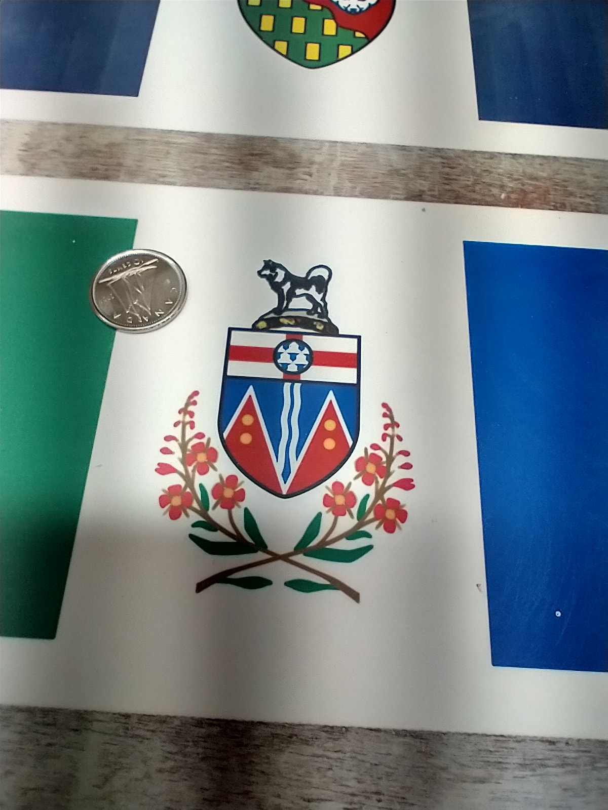
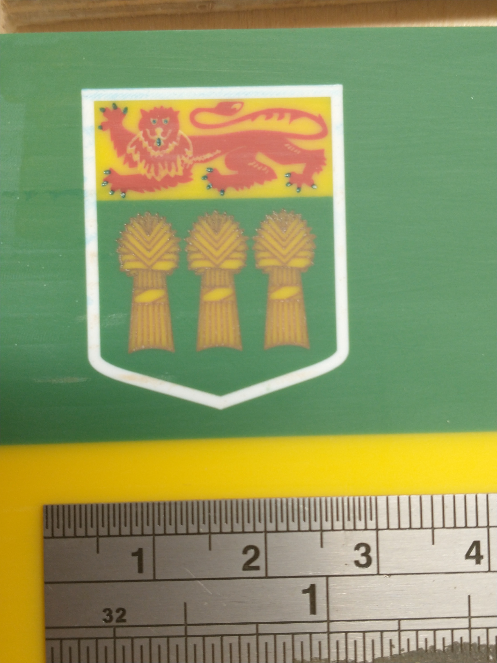
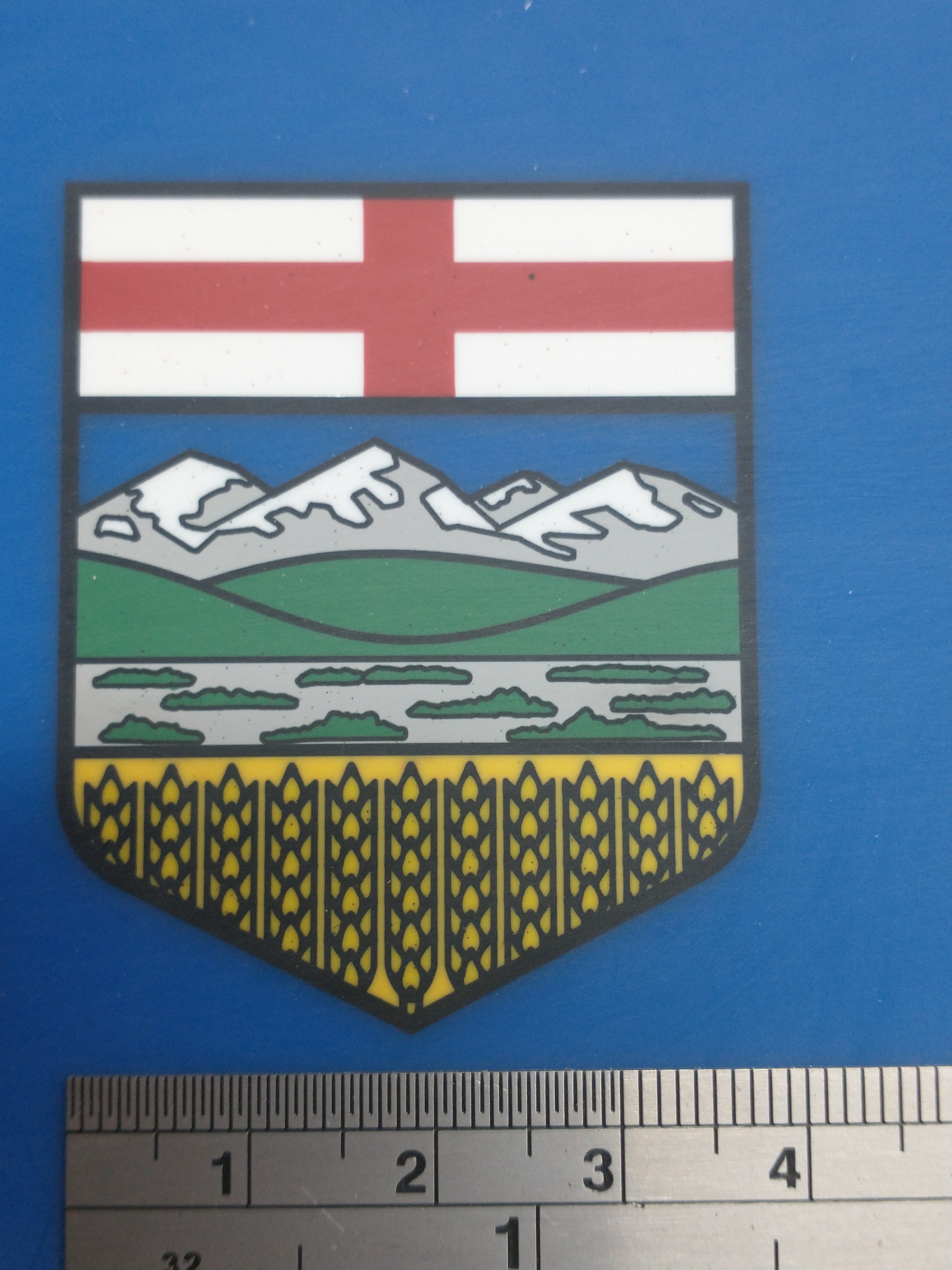
Here is a close-up shot of two of the flags. A few specks of epoxy that I need to sand off show up in the pictures. But they’re not really noticeable to the naked eye. There might have been some micro bubbles in the epoxy which got filled in with subsequent pours. But I think most of them are just surface spots that I didn’t sand away yet.
Wow! This is excellent work! You gave me so many great ideas from this project. Wish I could get more information on how you did your pours (such as order, technique, thickness, type of epoxy, etc..) I must say Chucky, great job =)!! Your an epoxy pro.