I have some thoughts on the new UI as someone who does UI/UX/Design for a living. That said, these kinds of projects are often polarizing, so some of my comments below are things I strongly believe in, while others are personal preference. My 2c for what it’s worth 
Design Language
In my opinion, the new UI currently is missing a cohesive design language, which impacts both usability and its appearance as a professional tool. For instance:
-
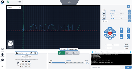
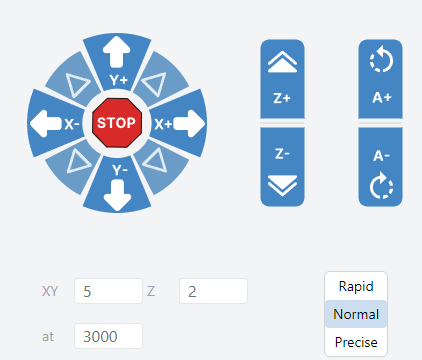
It doesn’t look like any grid system is used and thus cards and various elements within them are placed casually and often look like they are floating in space. I would also like to see more clearly defined grouping of related controls. To highlight one example, there doesn’t appear to be any obvious visual relationship between the toggle control to change the jogging speed and the inputs that let the user specify the speed for each axis. There is no indication what those inputs are meant for – one has to guess or assume that they are related to the nearest feature. I think this could be improved and would be helpful to onboard new users efficiently.
-
Common UI components and basic atomic elements are presented in many different styles:
- Buttons:
- The buttons for loading and removing files are grouped together without any spacing between them, are white with solid blue border and the entire “component” has a box shadow applied to it.
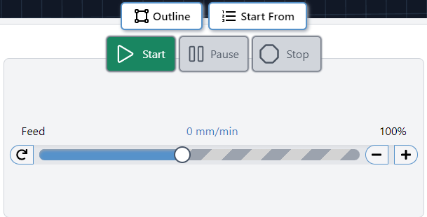
- The buttons for starting/stopping a job are separated from one another, use a different colour palette and are larger. While I do agree that these buttons should be treated differently, I don’t think they are different enough and as a result, look unintentional in nature.
- The jog buttons employ yet another visual style – this time solidly filled elements without borders and without shadows.
- The toggle button used to change jogging speed is another instance where a different look and feel is used. This time, the control is smaller, and another colour is introduced to represent the active state.
- The pagination buttons for the tabs – again, another colour and size.
To make things appear more cohesive, I would like to see a clearly defined pattern employed throughout. It would make the app appear more polished and in my mind would help with user confidence.
Aesthetically, the use of shadowing feels dated to me, and when used on darker buttons (such as the start button which is green and has a medium gray border), it makes buttons appear blurry and out of focus. Furthremore, it appears the use of shadowing may be arbitrary because there really is no need to convey that they are “elevated” off of the page in terms of their prominence or functionality.
-
Typography:
- Typography varies in size and weights throughout and as a result, contributes to what I consider a lack of visual hierarchy.
-
In general, I find the new UI lacking in contrast. Both the cards themselves, plus some of the text need more definition. I’m not certain it would pass WCAG guidelines for accessibility which I think should be considered as a bare minimum given that the app will be used in a wide range of environments that could threaten visibility. I’d also like to see colour used more effectively and strategically throughout.
Layout & Space
The preview window is huge. Like, really huge. Yes, it’s important, but does it need to dominate everything else? It’s actually forcing other controls - ones that users interact with constantly - into cramped spaces.
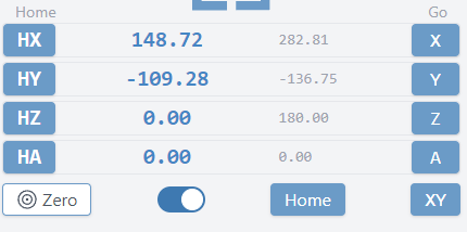
The location and jog controls, which in my mind are amongst the most used parts of the UI are “shoehorned” into a smaller space unnecessarily versus the current version of Gsender. I also find the new location controls to be a step back from the current UI. It’s not as clear to me what functionality is available here at first glance. I think this area could be cleaned up dramatically.
The file area in the bottom left - why make users toggle between info and size when there’s clearly room for both? And do users need to see the file path in addition to the file name? Maybe I’m unique in that sense – i have zero need to see the path… the filename is sufficient.
As I alluded to above, I’m not sold on the buttons in general, but in this instance I question their position. Why not nest the buttons for loading/unloading files and starting/stopping the machine within their respective cards? It would clean things up visually and help to connect their functionality with the features in the cards themselves.
In the bottom right, why is the first tab the console? I have to think the probing tab will be used much more frequently and as a result, should be the first tab.
Next, I personally feel like the workspace selection/control belongs within the location area. It seems most relevant there, given that when you change a workspace, the coordinates shown in the location area will change. It’s an area where grouping similar functionality can help reduce cognitive load.
Probably petty, but the giant status indicator really bothers me. In fact, I don’t believe it’s that important, certainly not warranting its size and overall prominence in the UI. Its primitive shape and position make it a distracting element. The fact that it isn’t centered with anything in the UI (even though the element itself is centered within the window) is also off-putting.
Touch Considerations
This is a big one: I feel that most buttons are way too small for touch input. Put yourself in the shoes of someone trying to quickly interact with the machine using their fingers - they’re likely to hit the wrong thing, especially with those tightly-packed diagonal jog buttons. That’s not just annoying, it’s potentially problematic when you’re working with a CNC. The speed controls (rapid/normal/precise) are another example - they’re tiny!
Both Apple’s HIG and Material Design both suggest a minimum touch target of 44px x 44px with a bare minimum of 8px between them.
I’d also like to see much larger targets for critical controls like stop etc.
Navigation & Controls
The left sidebar navigation seems to work well enough, though I wonder about the decision to move it from its previous home in the top bar - especially given the unused space up there now. This might become more relevant if portrait mode becomes a consideration for tablet users.
Contextual/Smart Layouts
I think there is a lost opportunity here with a static UI. I think the interface could benefit from adapting based on machine state. For instance, why not provide a distinct, optimized UX for setting up a job versus when the job is running. It would allow the prioritization of UI required for each unique task and would remove unnecessary distractions. For example:
When setting up:
- Prioritize loading, previewing, basic jogging, zeroing, probing etc.
When running:
- Larger preview area
- Prominent stop/pause controls
- Clear progress indicators
- Easy-to-read status information
While the machine is running a job, there is no need to show the file info area, location, jogging, probing controls (certainly not in the same way).
