How to get clean vcarve letters?

Hi everyone,

Me again! This whole CNC thing has a serious learning curve! So, I’m progressing in the right direction but it seems no matter what I do I don’t get the same beautiful lettering that everyone else seems to get using vcarve.

Please see the attached pic. I’m using Vcarve Pro.

I’ve tried multiple settings and bits, and I can’t get clean vcarve letters. The pic attached used a 2mm flat bit for the cleaning out, which looks good. Then used a 90 1/4" V bit. . .it looks, much less good.

I’ve also tried with a 60 degree 12mm V bit and the results were even worse.

What am I doing wrong? And/or how does one achieve clean vcarved letters that aren’t an absolute mess?

Thanks all,
Abe

@Abradel I suspect that your depth settings are the problem. If you will, please post your .crv file.

If you would prefer not to do that, let us know what you set your depth to for both the end mill and the V bit. Also, the font and font size.

Here you are - I would definitely appreciate any feedback to make this cleaner!

Thank you very much.Surrey Rd -NEW Vcarve File.crv (2.3 MB)

1 Like

@Abradel Here is a screen cap of my results for the text only. I will post my .crv file if this is what you are looking for.

A couple of questions:

  1. Your depth of cut is only .0295" or .6mm. That is very shallow. Is that what you are looking for?

  2. In your post, you say that your V bit diameter is 1/4" and that is what you have in your tool base. Is that the diameter at the widest part of the bit or the shank diameter? I suspect that it is the shank diameter.

Those letters look fantastic! So what settings did you use to make that happen? I’ll be curious to see if it looks that good once it’s cut. I’ve been having mixed results with things not looking how they should.

What depth do you recommend for sign letters?

Lastly, here’s a pic of my two V bits.

1/4" on the right. 12mm on left

@Abradel Okay, the pics help. I am set up to work in inches, so everything that I see in your tool database is in inches, too. If you work in metric, between us, we will need to “translate” as we go along.

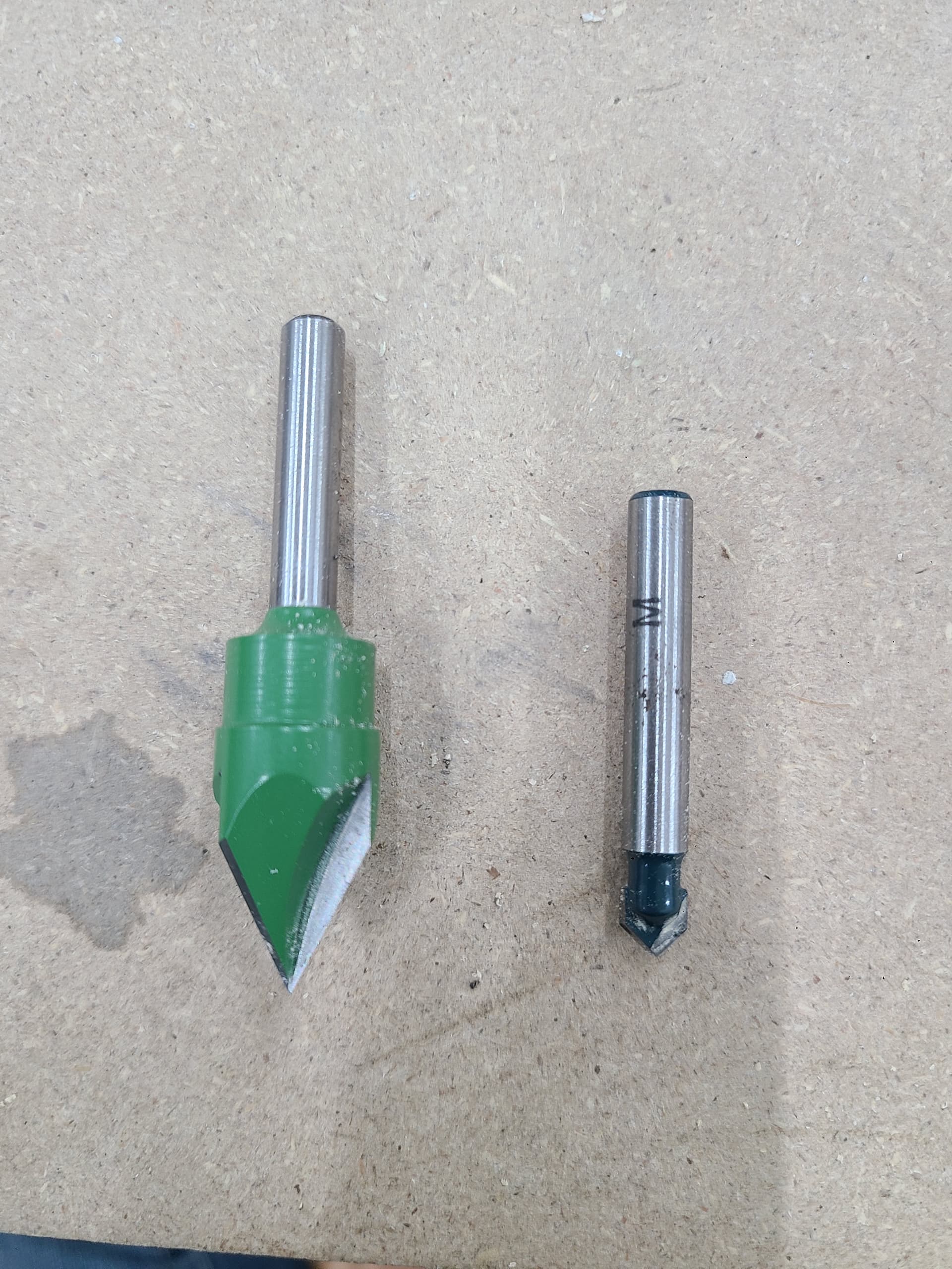
Your biggest problem is that you entered the bit on the left as having a .25" diameter. (That may show as 6mm on your pc.) As you have said in this post, that bit is really 12mm in diameter or to me 1/2". When you enter bits into your VCP database, the shaft diameter is irrelevant. The diameter that it is looking for is the diameter of the cutting portion of the bit. I think that you mentioned in another thread that you got the bit on the left at Lee Valley. According to LV, that bit is, in fact, 13mm at its widest. That is the dimension that you need to put in the tool database, under Geometry, Diameter (D). The bit is available as a 1/4" shaft or an 8mm shaft. I don’t know which you have, but the cutting diameter seems to be the same - 13mm.

The bit on the right could well be a 1/4" v bit since the cutting diameter seems to be the same as the shank diameter.

Now, for my settings. I tried both a 90° bit and a 60° bit to clean things up and they worked equally well. That LV bit you show is a 60° and will work fine. For cleanout, I tried to leave your 2mm bit, but it was too big for the smallest cuts in the letters S. I tried a 1/16" down cut mill and it could not get into the corners perfectly. Finally, I went with the 1/4" tapered ball nose sold by Sienci. It looks good. If you don’t want to buy that bit, you could go a small amount larger on your font and likely get good results from your 2mm.

Finally, and this is just a matter of taste. ( And, according to my wife, mine is frequently questionable.) You are using a 1/4" end mill to cut the groove around your lettering. Once again, is that the actual cutting diameter of the bit or is it the shaft diameter? If it is the cutting diameter, you may want to consider going to a 1/8" bit. Again, just a matter of taste.

Finally, again, how are you holding this down when you cut it out? I see that you are cutting to .75 and your material is .75, so you may be leaving an onion skin. If not, you may want to cut a bit deeper and use tabs or use blue tape and CA to hold the final plaque down.

I have not included my crv file because for some very strange reason it is almost twice the size of yours and is too big to upload. I can zip it, if you like.

Thank you for this detailed response, it is exceptionally helpful!

A couple of points:

  • The Lee Valley bit is indeed 13mm (12 was a typo on my part, trying to go off memory. I’ve corrected that)…In truth, I’m only referring to mm because that’s how Lee Valley had it spelled out on their site. I normally work in inches.
  • The 1/4" is indeed the thick line I’m looking for, that part is working out as planned.
  • It’s the middle part of your reply that I’m trying to wrap my head around. You’re saying the 90 and 60 should (in theory) both work for my purposes. You say that you tried the 2mm bit and it was too big, I think this is where I’m getting confused, You then said you tried a 1/4" and it worked? Isn’t that quite a bit bigger?

Lastly,
What settings did you use for your depth of cuts?

If you could please upload a zip, I definitely wouldn’t say no! Seeing the settings of someone who knows what they’re doing would be very helpful.

Thank you again!
Abe

@Abradel Here is the zipped crv file. I removed the two profile tool paths as they really weren’t at issue.

Surrey Rd - Grant.rar (868.4 KB)

As to the bit that I used as a clearance bit, it is called a 1/4" tapered ball nose. The one that Sienci sells now is 1/4" at the top of the flutes, but 1/16" at the tip. So, for shallow small cuts such as yours, it’s great to get into the corners. Here is a link to it:

MIne is a bit less steep and ends with a tip diameter of just less than 1/32". Sienci does not carry it any more, it seems.

I misspoke in my previous long post. A 1/16" down cut end mill will work as well for clearing.

Thank you for this! So you went really shallow with the letters too. Is there a better depth that you would recommend when doing signs?

Thanks again, this is really appreciated.

Abe

@Abradel I kept your settings. There is no magic depth, really. It’s a matter of taste. Part of the decision making should take into account how you are going to finish it. If the letters are very shallow and you apply a few coats of clear coat,for example, you could find yourself filling the letters. I think that, at .03, you could find that happening.

I suggest that you play with it using wood that you don’t particularly care about. Carve a few of the letters and see what you thing, then go from there.

Have fun. :grinning:

1 Like

Copy that! Thank you again

2 Likes

I am a newbee, but I have found that font selection makes a big difference. Also I like to use Down Cut bits when I can for a cleaner cut, with less fuzz. Just my two cents.
Oz

Just to be safe,I always use a flat depth of 0.2 or 0.3 inches with the V-Carve / Engraving Toolpath and a flat area clearance tool only if the preview shows a lot of flat bottom areas.