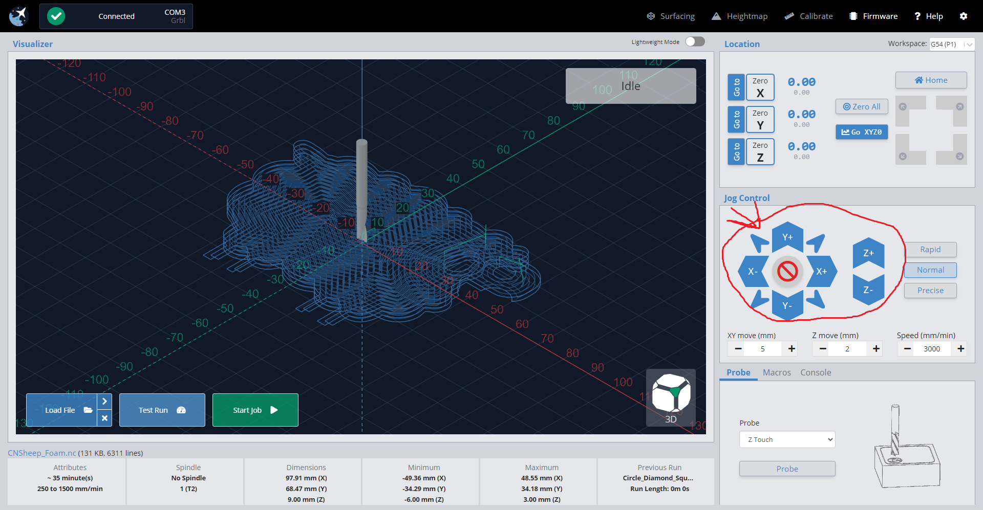
Hello, I’m using gSender for a couple of months, and it’s really great…but everytime I open it, controlling arrows are really out of place.
gSender have really modern and cool design, but those arrows are really pointy and they don’t look really nice…
Little bit of subtle design, and they will look great…other than that, gSender is really nice…
Maybe little bit less saturation on them will give more profesional look…
Hello and welcome. I kinda like the arrows, ya, you could make them more streamline but I think they are very functional. Often when I’m jogging I’m not looking at the arrows because I’m watching the bit and where it is going. Smaller more streamline arrows would make that harder.
But, I have an open mind, What are you thinking unique93? Maybe you could do a little art work on what you’re thinking and post it.