I needed to make a sign for a friend and because it was going to be 1200mms (approx 49") in length, after creating the full-sized design using Vectric V-Carve Pro, I drew a line 600mm from the beginning and saved the 1 - 600mm section to one file and the 600 - 1200mm section to a second file. I then opened the second file and moved everything down to the bottom, thereby having two files, each starting at the same baseline position.
I saved the toolpaths to their respective files, then positioned a fence on my Longmill bed, running along the Y-axis so that I could slide the board into its start position. I run the first gSender file, and after being really happy with how it milled, carefully marked a reference pencil line so that I could advance the board forward the required 600mms to run the second gSender file.
As you can see in this video, I had somehow erred in the second file and shifted the text when I’d attempted to move it down the 600mms. But after going back and readjusting everything, I was able to complete the test. The final piece went perfectly.
I should mention that the sign is formed of three separate boards, each 1200mms (49") X 185mms (7 1/2") X 25mms (1").
As I gain more experience CNCing, I’m sure I’ll realize that there are much simpler, and more elegant ways to accomplish this, but for now I’m just happy that it worked out so well!
Marty, if you need to do this job before getting to grips with software solutions you can make an extended line of text easily. If you can accommodate lets say… 2000mm of board by adjusting its position and sliding it though the machine once or twice. Split the text and make make two or three separate files. The workpiece will not care which position it occupies if it is between guides on the baseboard.
Each segment can have the machine centred on it before the cut and in your text creation software. It is easier to avoid cutting through a letter. In general terms, typefaces will frequently have an equal space between the letters as they are laid out. The exception to this general rule is when the text is using a well understood ‘kerning pair’. I have taken the liberty of including a link to a useful introduction to kerning; which explains the issues very well .
The final piece of the puzzle is to arrange your separate files so that the spacing between the start of the lettering on one workpiece, is well spaced from the end of the lettering on the preceding workpiece. So where you have a 10mm space between the typeface letters on a workpiece, you will opt to have 5mm of leading space on the workpiece and 5mm of of trailing space after the last letter has been engraved. In the case of your short video presentation, you could, for example, add an index mark along the face edge, at the exact centre of the workpiece and each move of the workpiece would line up the index marks so that the ‘separate segments’ would all be engraved in the correct place and you would have a single continuous workpiece.
Hi Marty,
That text adjustment is so that you can have a consistent endpoint to each part of the job. The kerning thing only becomes an issue when you write text.
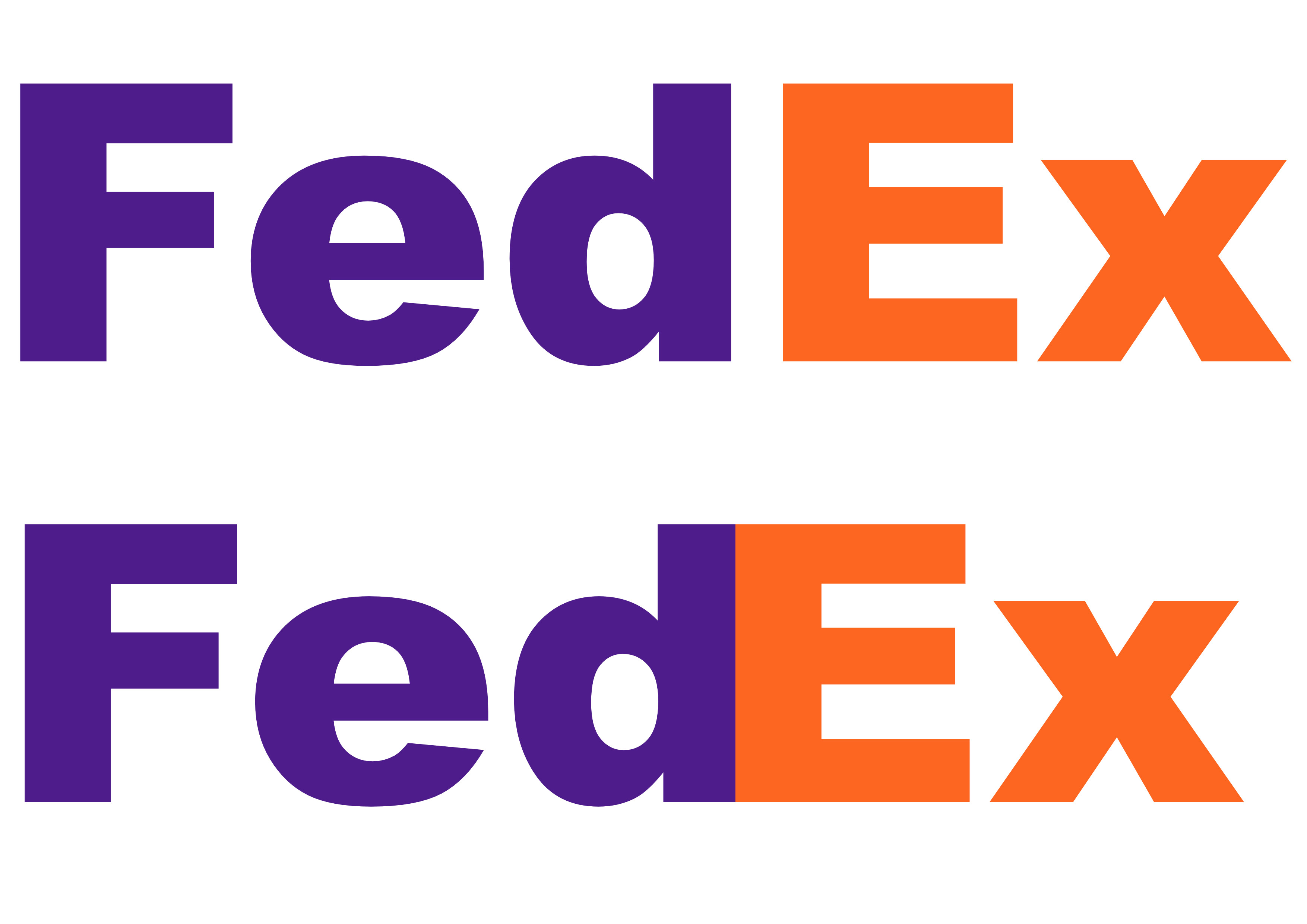
e.g. If you wanted to design a sign that included the words Fed and Ex, Normal typing would get you FedEx. If you could could adjust the kerning to correct the design, you would end up with the letter d and the letter E just touching.
Here is a kerned example in the actual FedEx colours. I think I have the colours correct but may have missed the actual Pantone colours values used. I have just judged it by eye with a colour temperature meter so it may be a few gradations out.
the top row is the typeface (note that this may not be quite the same typeface as the FedEx logo) typed according to the typeface metric tables that are used to layout the type on the page. These tables are an integral part of every character and are stored in a form that the software will read so that it understands how to display the character.
The second line of text is to show the adjustment of the kerning between the letters ‘d’ and ‘E’ and this now is a reasonable facsimile of the FedEx logotype. The gap between the letters has been removed and if you were carving this, the bottom example would provide the more accurate representation.
I also included a simplified image showing some of the metrics (information needed to draw the character correctly) required and the numerical values for these are all stored within each character. The top of the line across a capital letter A is known as the crossbar and this is one of the metrics missing from the illustration.