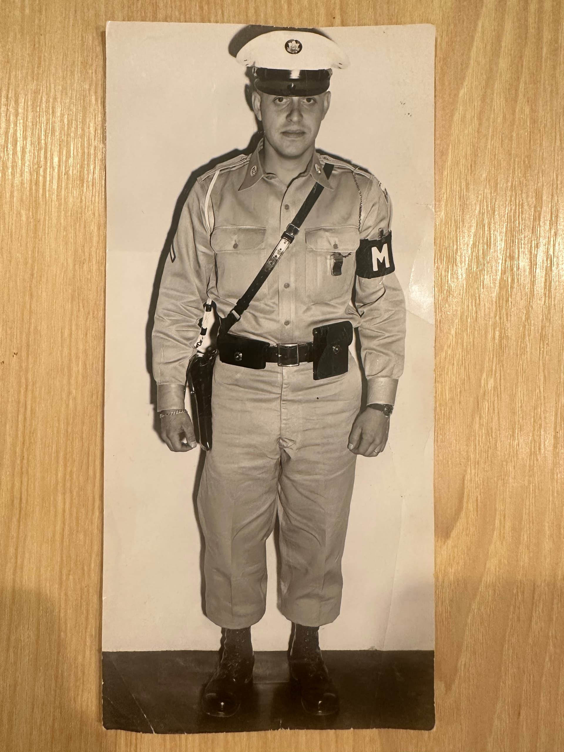
I’m working on a Christmas gift for my dad—a Photo VCarve of this old photo of my grandfather in the Army as an MP back in 1960 (attached). I’ve never done one of these before so if anyone out there has experience with this I would love to hear your advice.
Should I crank up the contrast as much as possible and reduce the grey areas? For instance, there’s a bit of a shadow around him (particularly on the upper left side of the photo, but it’s all around the photo if you really look)— would you crop those spots out or leave them in?
His black boots are on a dark floor. I’m thinking I’ll need to change that to a solid white background or you probably won’t be able to see them?
What V bits and settings do you usually use for black and white Photo VCarves? Any tips for crisp, clean results?
Basically—if this was your photo, what would you do to prep it for carving?
Thanks a lot in advance for any advice—really want to get this right!
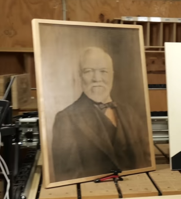
***For reference, the additional attached photo of a finished VCarve Photo portrait is exactly what I’m going for.
I really found with the laser that the best way to get things dialed in was to run tests. I agree that starting with a tutorial or video is a great way - and then after that, try some experiments on scrap stock to see if you can get things to come out the way you like.
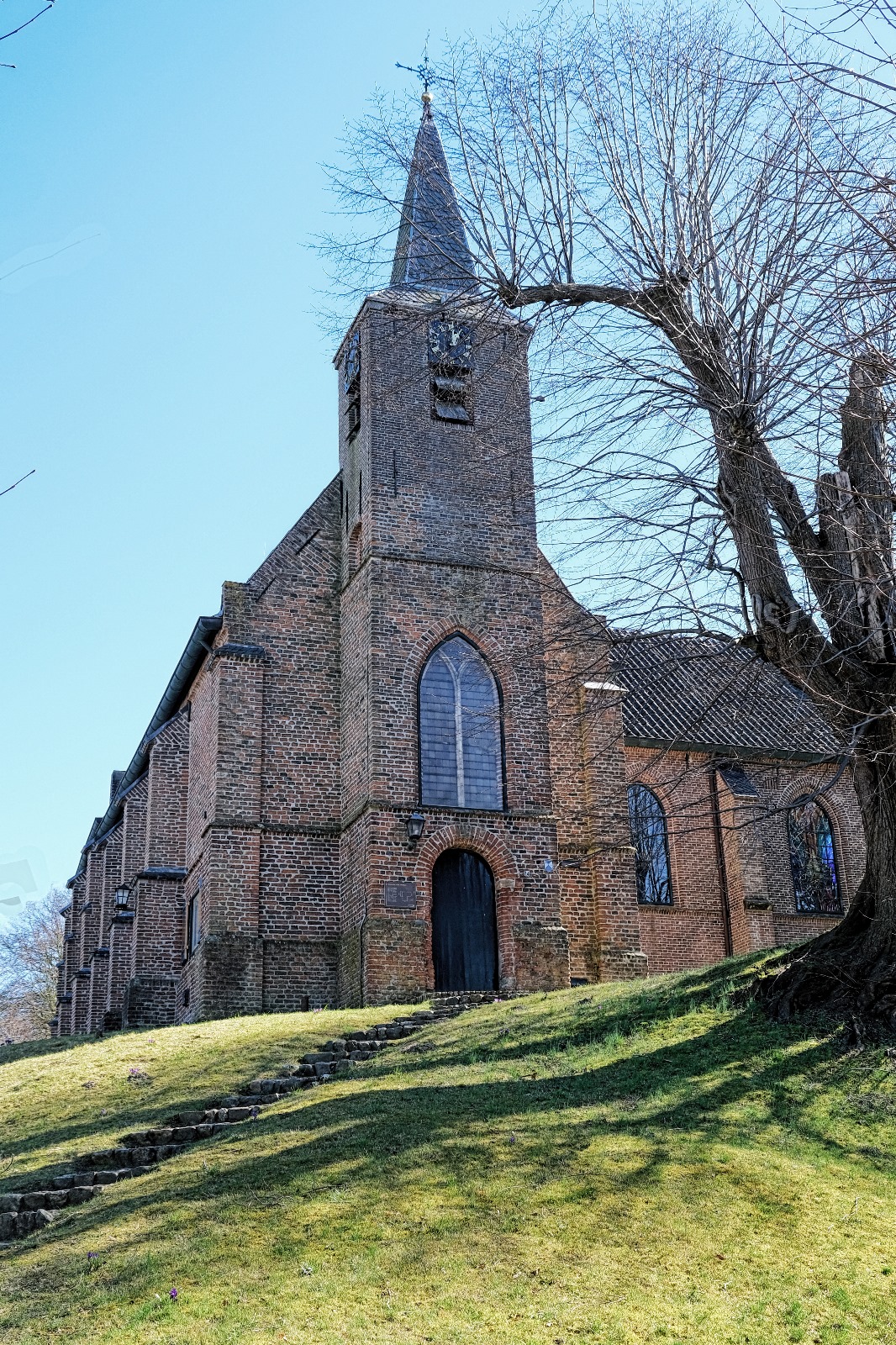
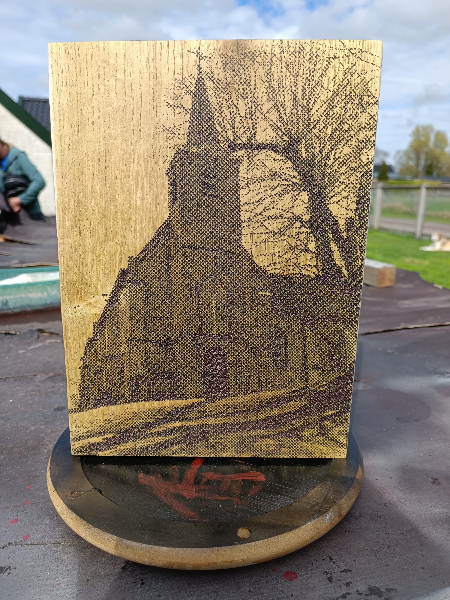
For an art exposition last summer in a small church up a hill, where I had a coop with an artist, I had some time left and decided to experiment with photocarve. I used white Robinia wood for contrast and hardnes of the wood and had a picture made by a photographer of the church the expo would be held.
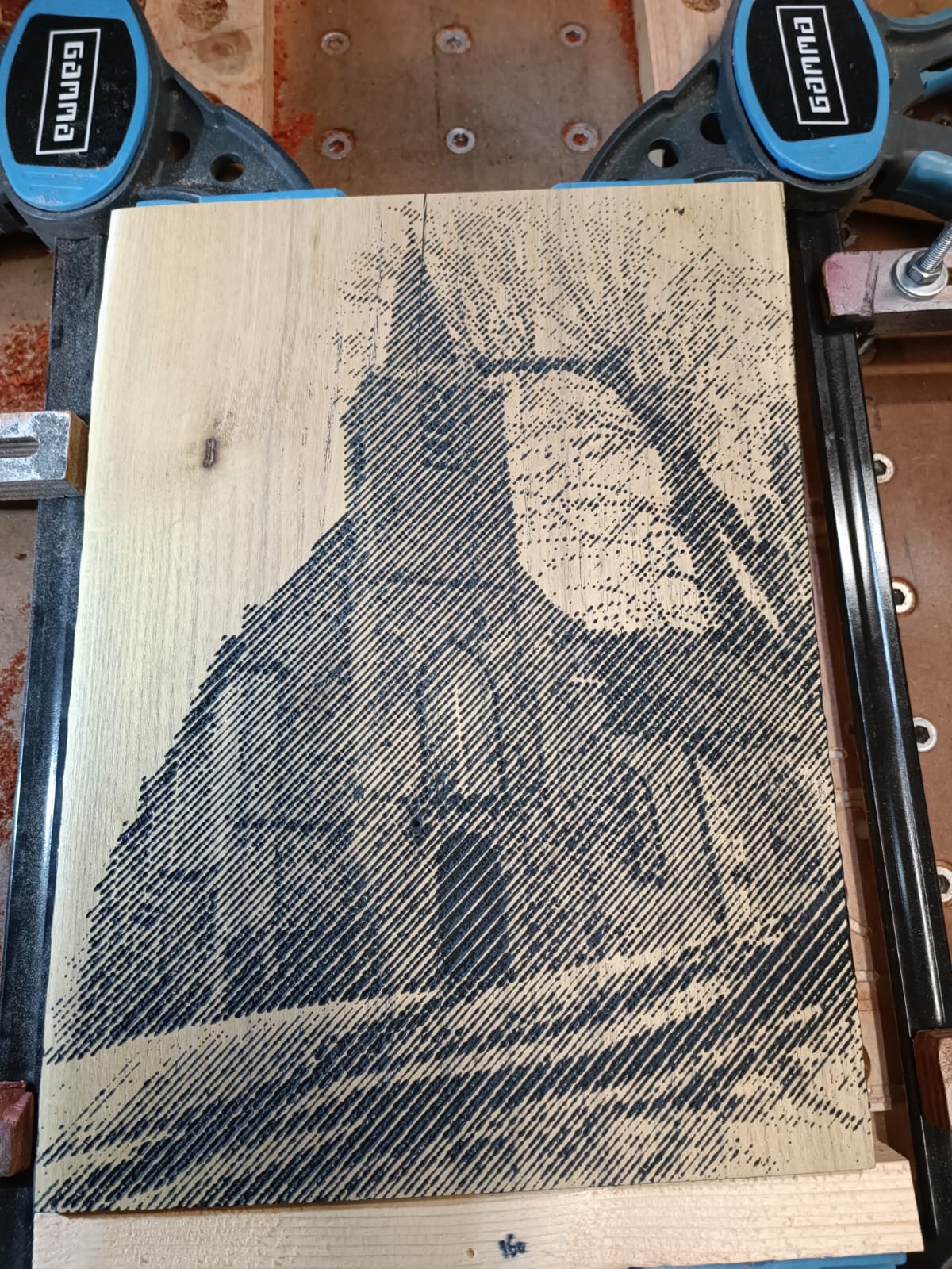
I’m prety sure I used a 60deg vcarve bit and that I contrasted the high res picture like a madman. You will not get high res with photocarve so all has to come out of the contrast. (Hence the light wood.)
I made two pieces, one single 45 deg diagonal and one double 45 deg diagonal. They turned out recogniseable but grainy too. I think for more resolution, a 30deg engraving bit might be a better choise.
The visualizer renders in vcarve give a neat representation of what you are going to get. The real thing has a wee more spark to it and the depth jumps a bit more at ya but overal, the render gets close.
The thing with these carves is that the bigger you make them, the more detail it can contain and the better they will represent the origional photograph. My two examples are way too small to be impressive but they do/did attract attention none the less.
I’m out the shop atm so can’t give much detail but if you like a wee more detailed info on feeds, speeds, depth and what I did to the pictures, I could dive in and provide some more technical info on settings.
Just noticed your clamping setup in your second photo. I’m thinking that might be a good way to setup a board for surfacing as the entire top is free of clamps. A couple of blocks attached to the spoil board and surfaced would provide support and keep the bottom parallel to the spoil board.
You should change your name to Clever_Innovative_Eddie!
Whenever I have a thick enough board that isn’t too long (mostly trunk cutoffs), I use glue clamps and clamp those down to bed to indeed move over and beyond the project for a clean surface job.
Signed,
Uses whatever he has laying around in the shop before spending a dime eddie.