No worries! CNC work is a process of stumbling from one problem to the next. 

Depending on the wood type, the results of one set of values for feeds and speeds for each wood type will change. Fuzzies can be removed with a soft brass brush. When first moving from MDF and plywood to using better quality wood, I bought scraps of many different types of hard wood. I liked all of the hardwoods I have sampled.
I lean now towards American Maple as my gold standard. It is good for holding detail and takes a large variety of nice finishes. I like to use walnut but I have been unable to stop its tendency to break out chips that are sometimes larger than I want to see. I have had good results with American Cherry. The following chart may assist you.
Wood Hardness.pdf (32.6 KB)
If I was doing the work you are pursuing, I would make the carved pattern the last operation to be carried out on the finished surface. There is a lightly tacky self adhesive paper that I sometimes use with a laser, if I am trying to protect a surface. Carving with a V bit could stand a little experimentation with scraps, depths of cut and number of passes, step down, stepover, floor of carve, chamfer edges or cut in one.
V carve depth may be set by line width so that the width between both edges of the carve can determine and hold the depth of cut. Vectric and other software will let you adjust the depth that is automatically dependent on width between pattern lines. Some typefaces lend themselves to carving while others do not.
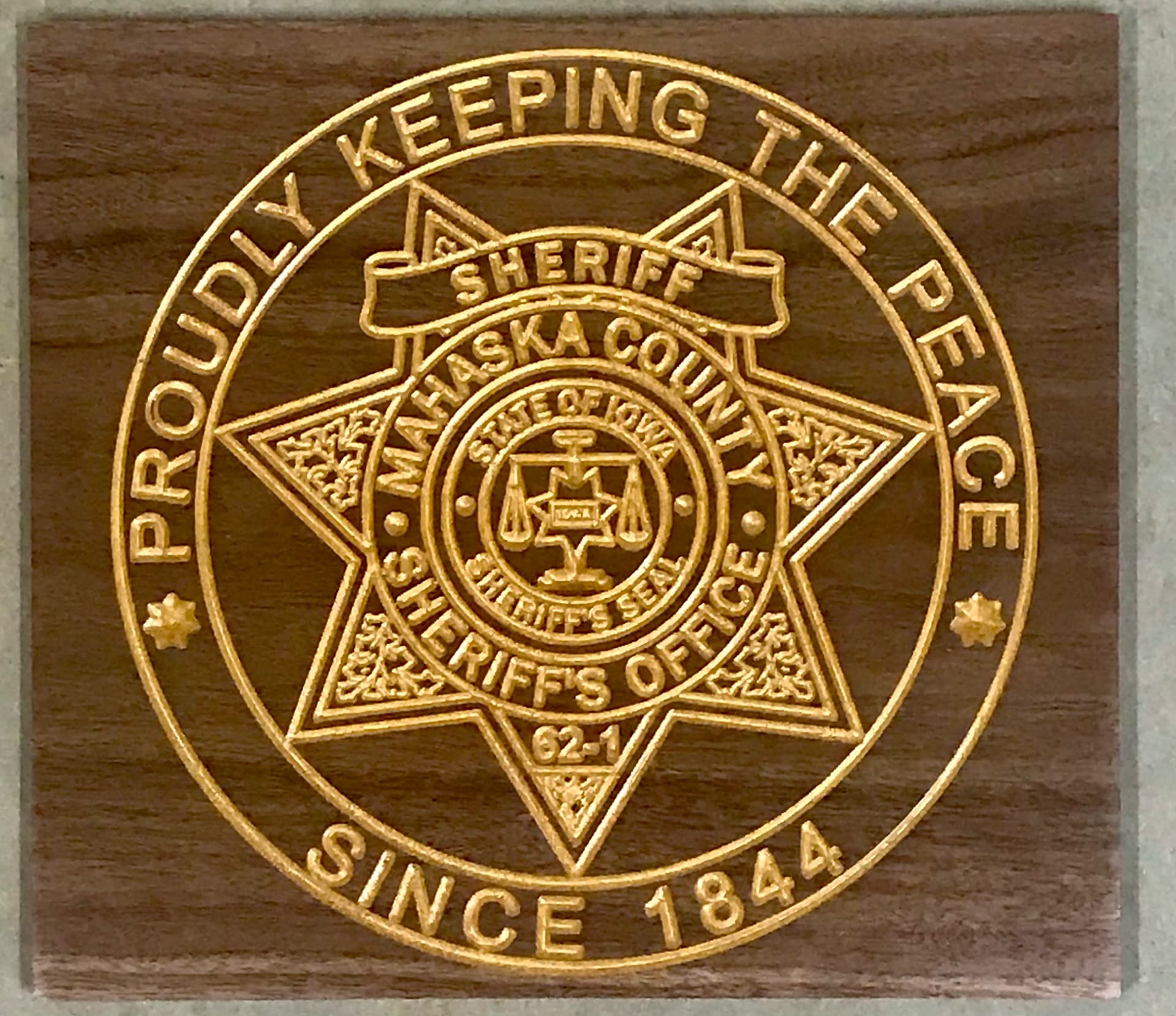
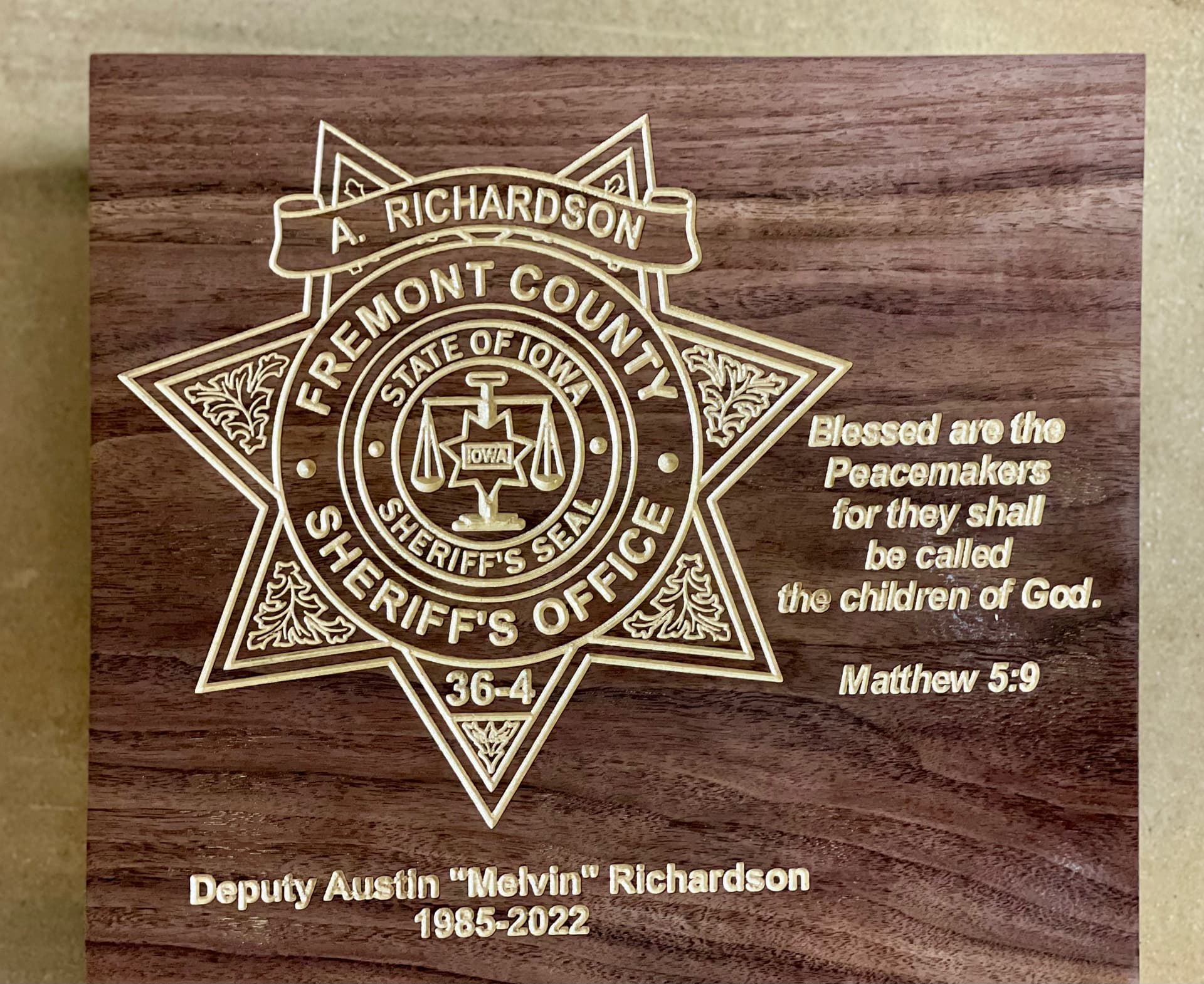
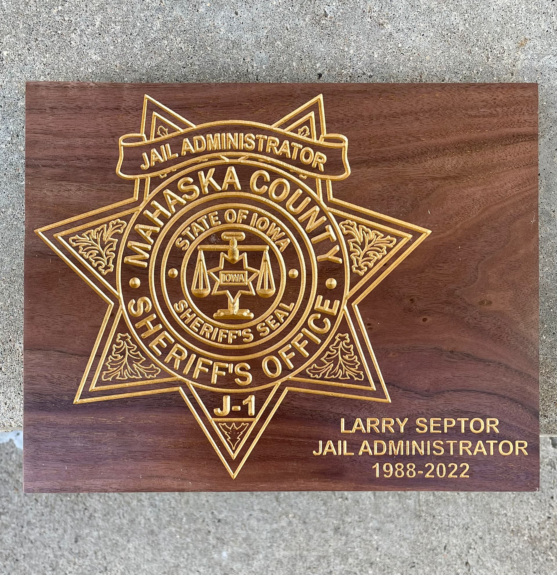
Looking at the Fremont County Sheriff’s seal as the best example, it is possible that the higher contrast between the silver colour and the wood has contributed to it looking sharper. Clarity of cut can be helped with cut depth. The pattern inside the star point at 9 o’clock is cleaner than the one inside the star point pattern at 3 o’clock.
Where the features you carve lay close to other features, then finer lines will probably help the overall impression of clarity. The text… “State of Iowa” and “Sheriff’s Seal” looks to be slightly too large within the double ring boundaries. You could try setting up the same design file in Vectric and giving the text a little more breathing space so that it is not as close to the rings. The same might apply to the scales of justice and the depth of cut.
I guess that designs always look much better in the design software we use. I don’t know if Vectric’s software permits you to specify a space between one feature and the next. If it does, you could start with opening the space between features and noting the numbers. That could then be your goto set of numbers until you decide you want to change. It makes the designing process far easier.
Cheers! 
Jeff