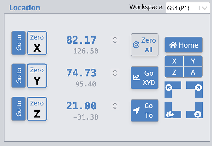
The “Zero All” and “Home” are so close together, they could accidentally get switched
Move that Zero All to the lowest corner of the screen, and give it a forbidding color
and a smaller button. Just a thought, based on having done that on another system.
One UI/feature expansion I’d love to see is camera integration for:
- machine bed overview
- alignment/probing
- “OMM-style” measurement (click features on-screen and measure between them using relative distance traveled)
I would like a live gcode in console not reading way ahead like that, also be able to edit and save like UGS. I very much look at and understand my gcode.
New user with old CNC router and find the current user interface to be a quick study. One problem I’m running into is end crashes. My limit switches don’t seem to be working with my board. Is there a way to set limits in the interface for the overall and for situations that need other limits set to avoid areas in difficult setups.
I actually wouldn’t change too much on the UI, I use it every day and am very comfortable with the layout. I am using a 40" monitor and wireless mouse so that I can be mobile around the CNC when setting up.
One feature that would be absolutely fantastic to have would be a touch probe for tracing out templates… that is really my only need, other things are wants but basically irrelevant as I I like the GUI.
I think that Gsender is fine the way it is. Don’t try to fix something that ain’t broke…
@mike2 For the most part, I completely agree, Michael. I think that the issue that Sienci will have to attend to is that users interface with gSender is many, many ways. Some are running it under Windows using very large monitors and mice. Others, are still on windows, but on small touch screens. Others want to use Linux. Still others want to use raspberry pi. Bring in game controllers and joysticks and bring in more ways to interface.
The danger in trying to be all things to all people is that you can end up being a compromise for everyone. I don’t envy Sienci’s position.
Just saying.
Kind of moot now. I used to wish there were buttons to mirror the cuts, but I have since figured out a macro to do that.
I think Gsender is an excellent program. I would like to see “Go to” and Zero X, Y Z
seperated more.. as Go to X and Zero X farther apart. It’s easy to click on zero x when you mean to click on go to X.
Also I would like to have an status indicator specifically indicating that the Emergency Stop Switch is engaged, and what other conditions in more detail as to what is keeping from coming to ready.
Great feedback all, keep it coming!
We’ll have more ideas to share shortly but I’d generally agree with most of the responses so far that there are at least a few tweaks we can consider making while still trying to not change too much from what already works with the current design
I usually go the other way around. I have, more than once, hit “Go to” when I was going for “Zero Z”. Usually with a longer bit than the previous bit, driving it into the workpiece.
I am using an old montior anf it would be nice for a high contrast mode or a dark mode. the gray on gray is great in the basement, but when I go to the garage, it is pretty washed out. it is worse when you put the glasses on for zeroing the laser.
I have also noticed that when use the game controller(XBox) that when you setup a button to switch modes, it seems to want to not go to precise, the display shows it, but the button action is fast or normal. so back to using the onscreen buttons. could be just mine, and it only started happening after the last upgrade.
What’s the macro for this?
I would ask that the workspace to remain at what G55, G56 etc to stay on this workspace rather than reverting back to G54 once task is completed. This would be beneficial batching projects.
@rdmay Welcome to the group, Rick.
I don’t know if your issues can be addressed in a new release of gSender, but the issue has been discussed here and solutions provided by Sienci.
Here is an except from the gSender docs
Here is the thread that KGN provided info on
I’d like to see you put the spindle, laser and rotary selection together in the same place and have gSender make the needed changes to settings automatically. Currently rotary is in a different location.
Also, I would like the job Origen not to change back to G54(P1) from whichever one I’m using, every time I finish my cut. I tend to have several jobs on my spoilboard at the same time and I use different ones for each job for the purpose of x,y,z zeros.
Adding to the “camera integration “ idea. I run my machine in a different room than my computer. Sometimes I wish I could see the movement when I’m jogging to position before I walk in to start my cut. Primarily due to touch screen jogging not working properly, however being able to record video of my work would be awesome ![]()
![]()
![]()
![]()
On another note, I would like to eliminate the extra box for the rotary and go directly into the SLB.
By the way, my laser offsets do not work in the current version and the touch screen jog is double the jog distance selected. I walk a lot between rooms to make a cut , then again, maybe I need to walk more ![]()
![]()
![]()
![]()
I would like to see a clear indicator to flag the actual Workspace in an in. So many times it drops out of a selected Workspace back into G54. Maybe something like a background colour change in the Location screen. Eg blue is G54. G56 is Green.
I get caught out so many times by the system defaulting back to G54.
11 posts were split to a new topic: Cool Camera Setup and Machine Safety
Hey folks,
First off, thanks to everyone who’s submitted feedback so far - we’ll be sure to keep common concerns and comments in the back of our minds as we continue iterating.
As stated previously, our goals for the UI refresh are as follows:
- Maintaining gSender primary principles of simplistic unopinionated controls, substitute technical jargon for simple language, and only showing functionality that you need for your specific machine.
- Better support for various screen sizes (from desktop down to phone) and more intuitive, usable touchscreen support.
- More thought into use of space for existing features to not feel like an afterthought and create space for new features to slot in.
- Lower technical debt on the front-end side of the application.
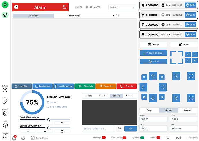
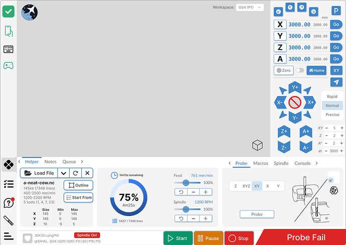
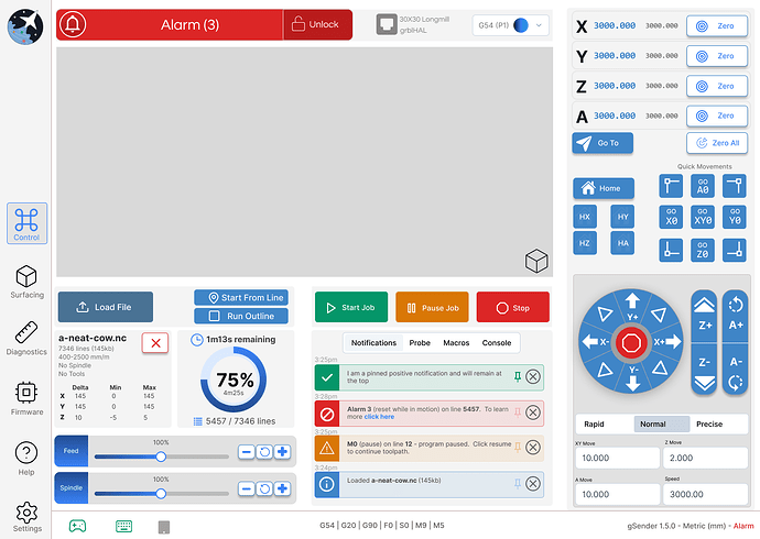
With those goals in mind, we’d like to share a few early ideas from our very large drive of mockups and custom element design. You may notice there are some areas in which the mockups are relatively similar and some in which they differ wildly. Feel free to let us know if there are any particular elements which stand out as particularly good/improvements/solve an existing problem and any areas that you think are confusing or still miss the mark. We’ve tried to pay specific attention to pain points that we were already aware of/have been mentioned frequently.
Feel free to mix and match specific elements of all 3 that you like/dislike. No part of any of the 3 is set.
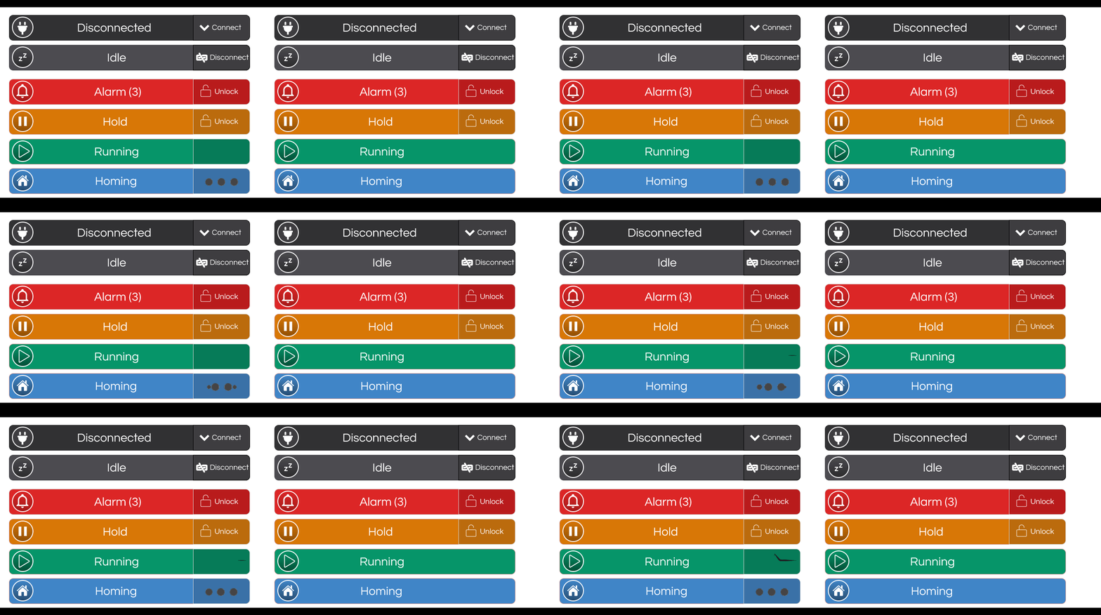
For the time being, try to avoid commenting on the look and feel/colours chosen - that process will be done last as most of the mockups are relatively low fidelity and have been standardized in terms of colour across all 3. We are already mindful about adding some sort of dark/light mode or contrast mode.
Thanks in advance and look forward to hearing your thoughts.
Treatment 1:
Treatment 2:
Treatment 3:
We’ll have more to share next week!
@KGN My vote is for treatment 1. I particularly like the separation of the “zero” and “go to”.
