Hi ! I think that having a sliding Button to navigate back and forth into the gcode file with a dynamic representation of the project state would be really really cool and usefull instead of having a »start from line button » ![]()
1 Like
I dislike the quick movements in Treatment 3. They aren’t intuitive. The layout does not correlate to what the buttons do, other than each corner. If I push the middle button on the leftmost column, i expect it to be an XY move to the middle left side of my machine.
@chrismakesstuff
I like # 3 larger blue circle with the controls, easier to touch with your finger
Thanks for your feedback thus far, especially the comments about specifics aspects of how we’ve laid out buttons, their design, and how you compare them against each other and against the way gSender is currently.
We’ve since put together more ideas that we’d like to share. Please continue giving feedback or if you’ve already commented then feel free to reiterate what you do and don’t like about the designs below. Some of these designs might not have yet addressed specific people’s feelings, but we’re still aiming to work toward that in any way we can.
With these new designs there will be a lot more to look at, so try to just focus and give any feedback you can. We wanted to come up with a couple scenarios of how they would look while you were using them, so that they could feel more real. I’ll also include comparable screenshots of how gSender looks currently in similar scenarios. Otherwise, have a great long weekend!!
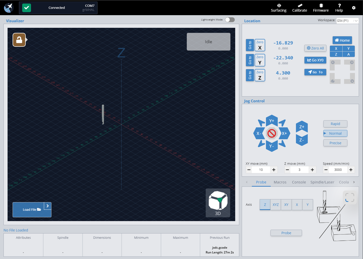
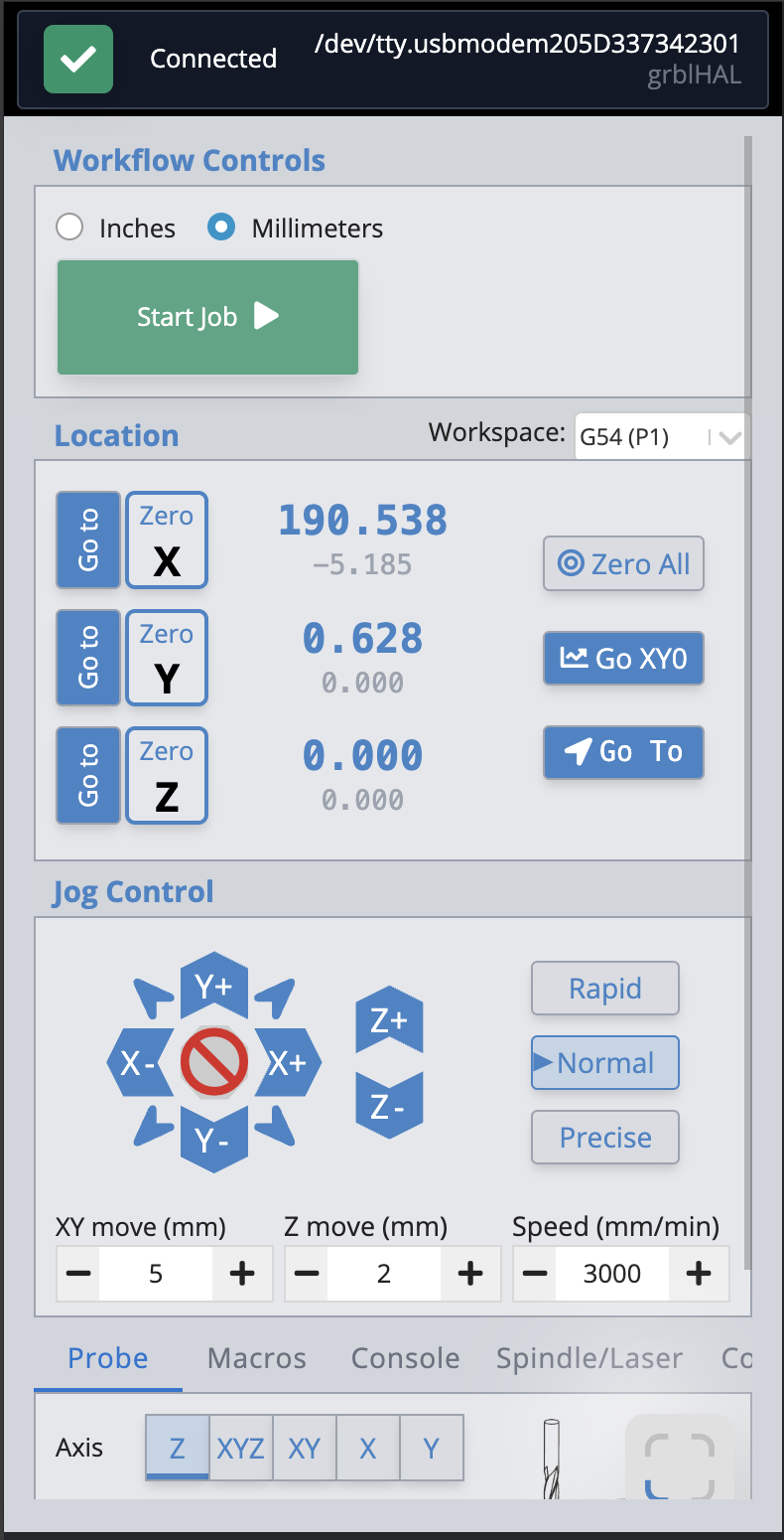
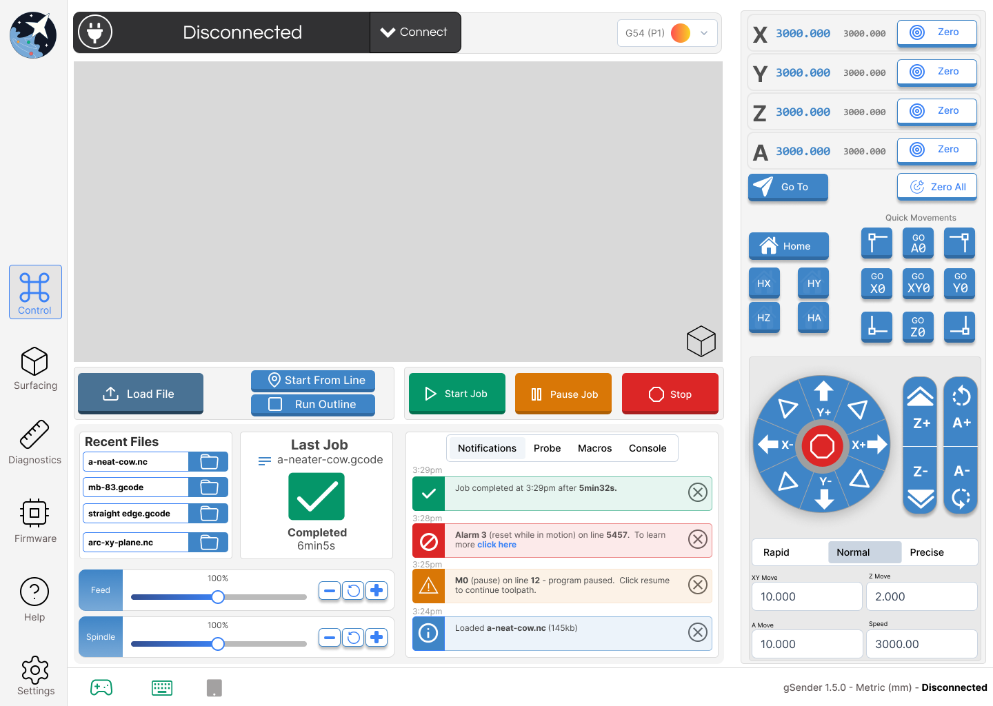
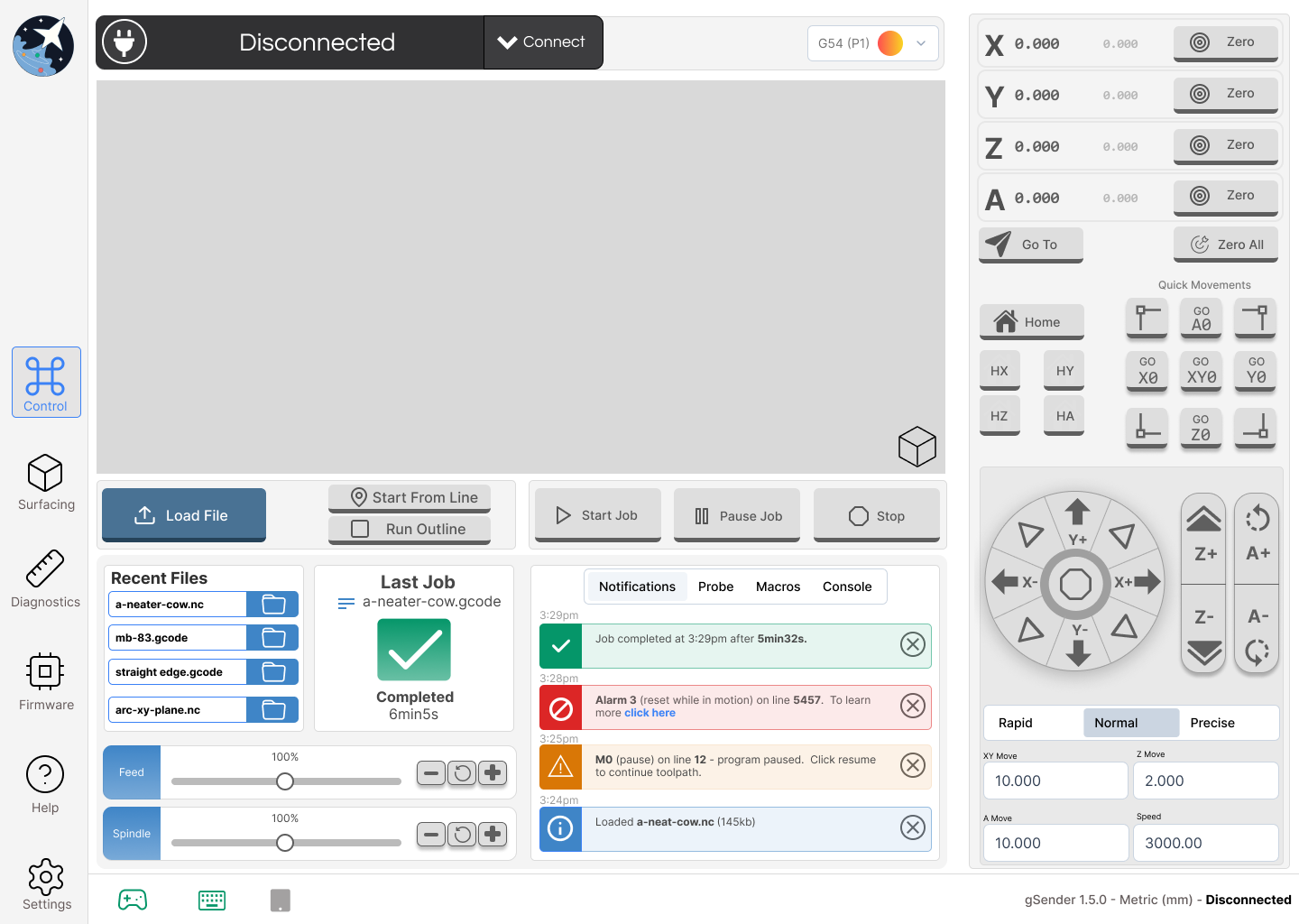
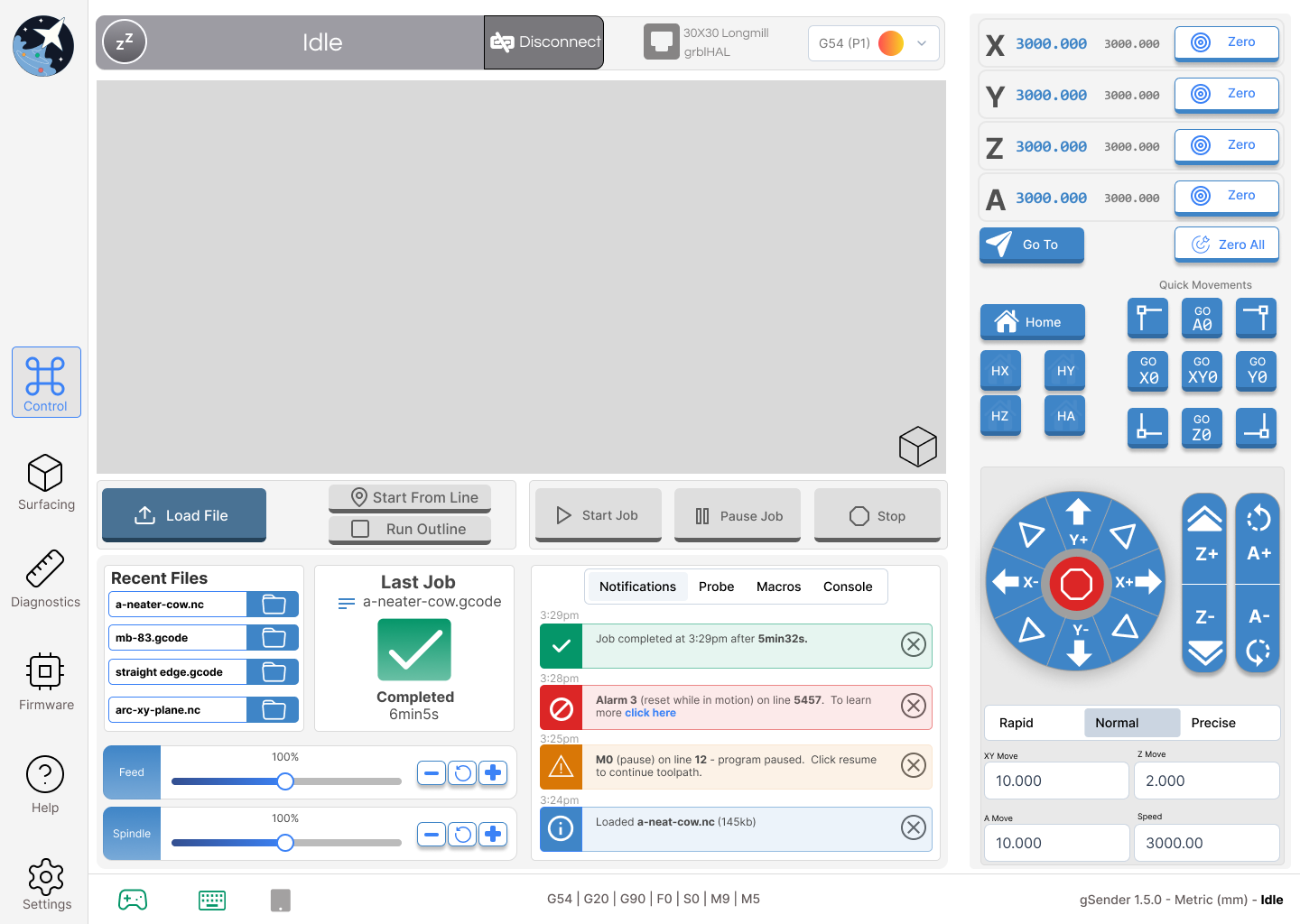
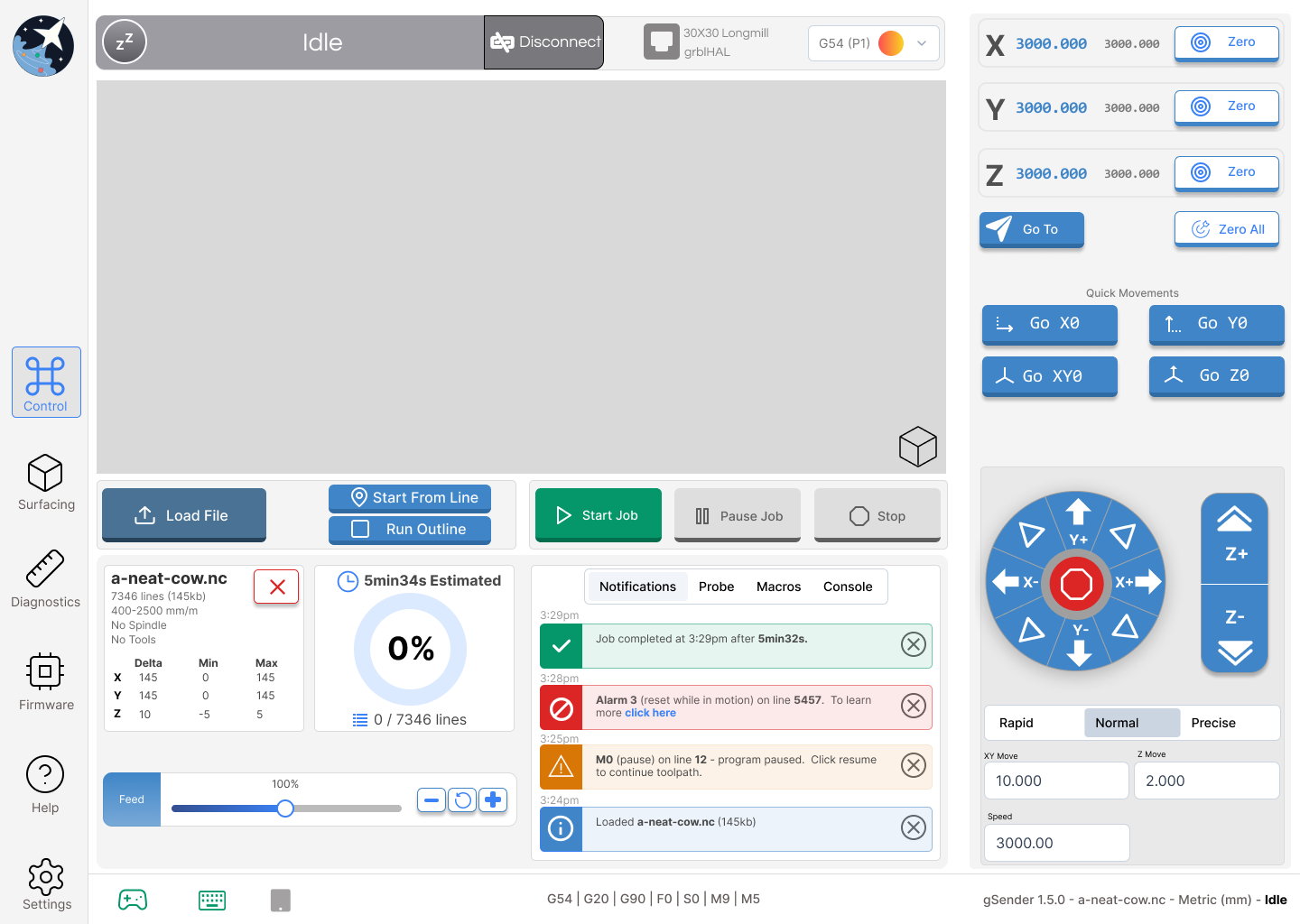
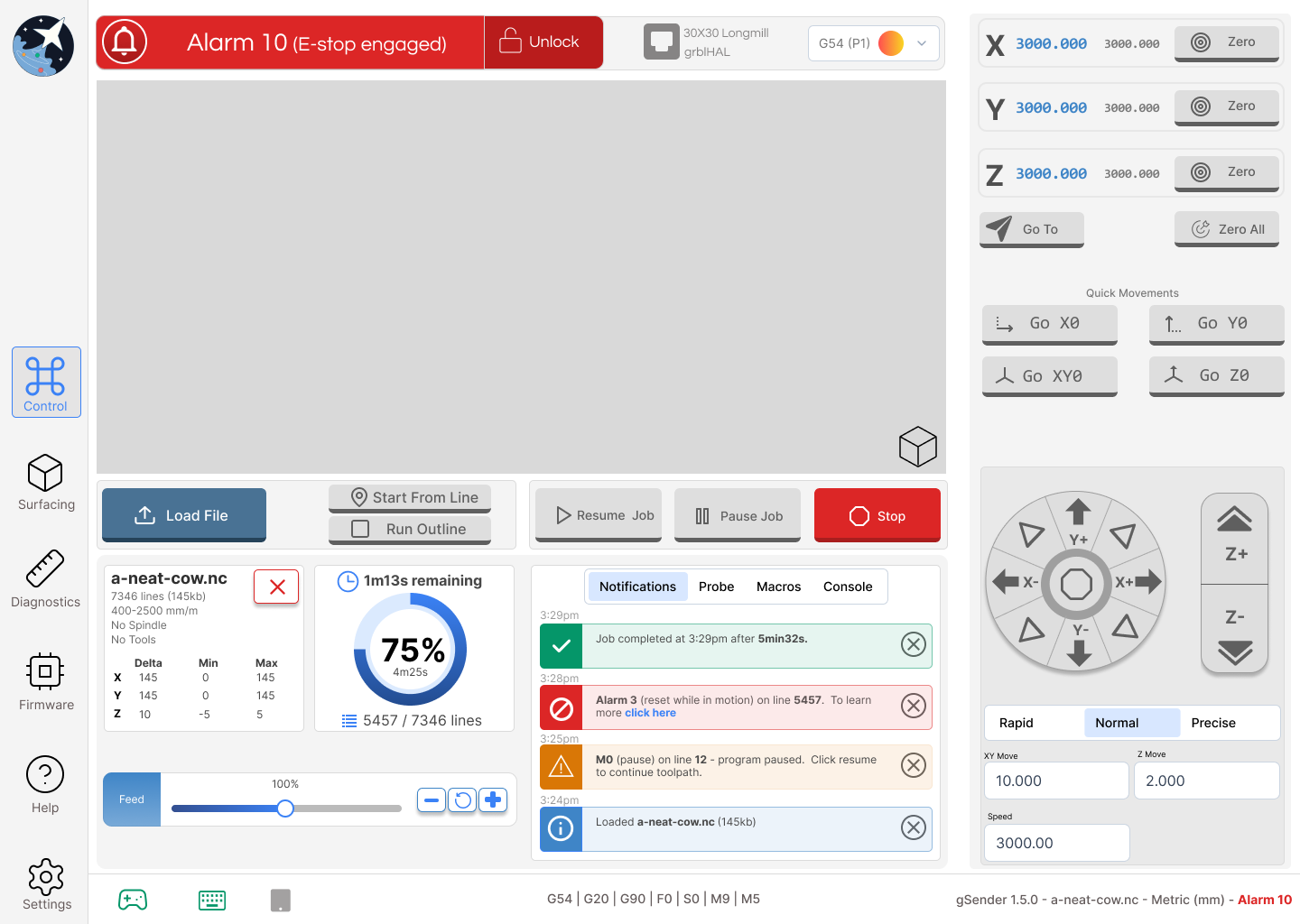
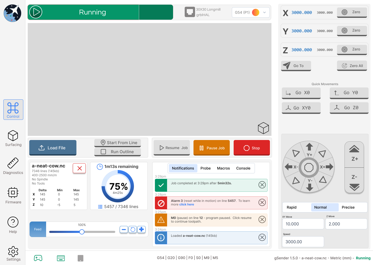
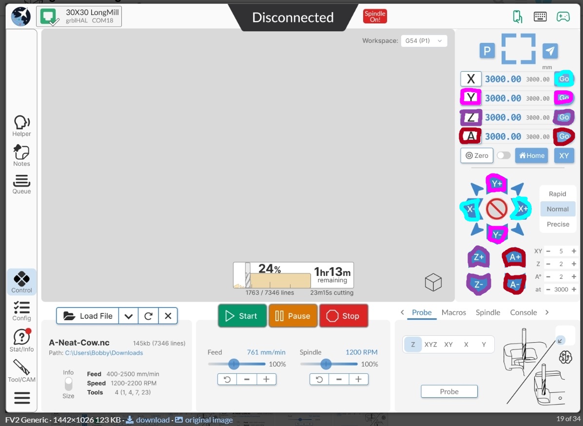
Current gSender:

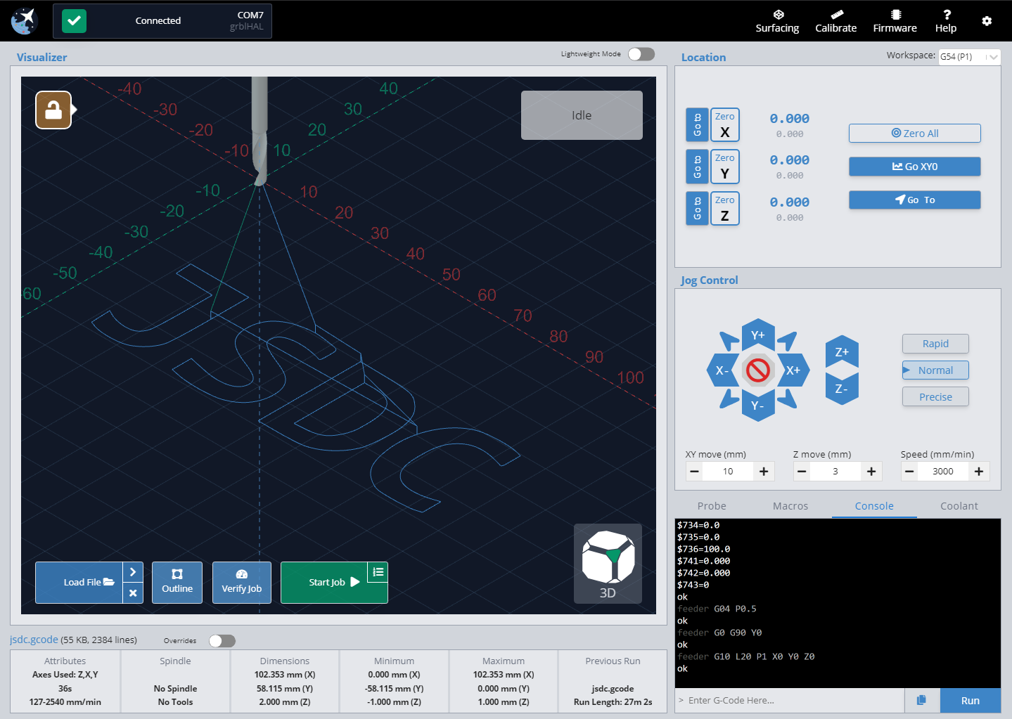
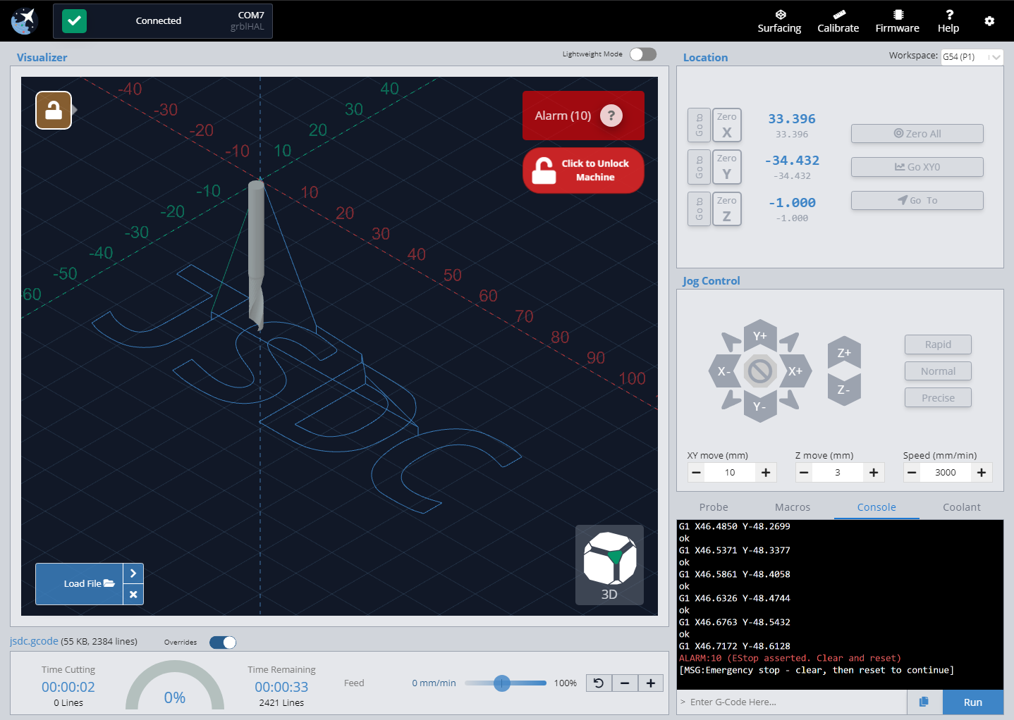
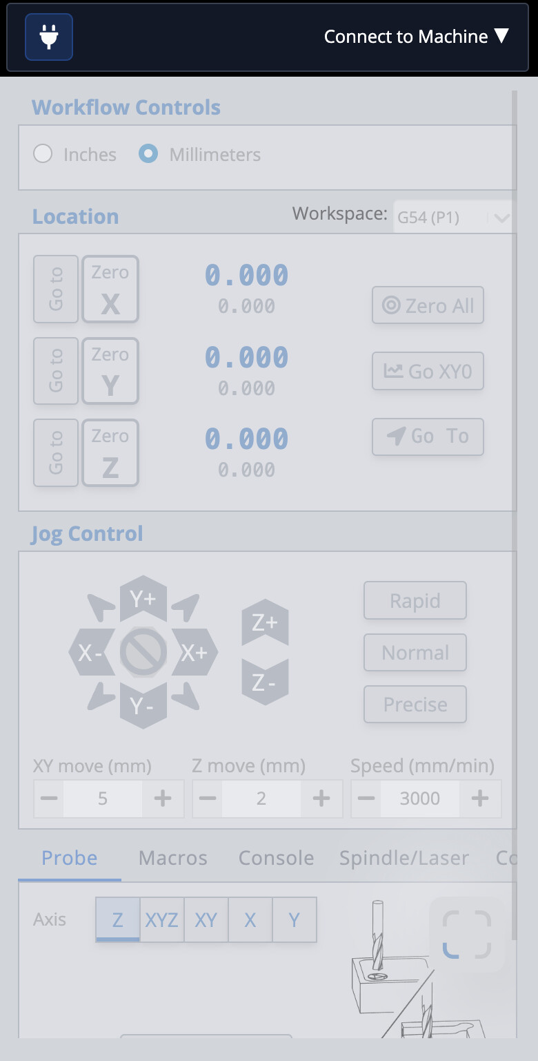
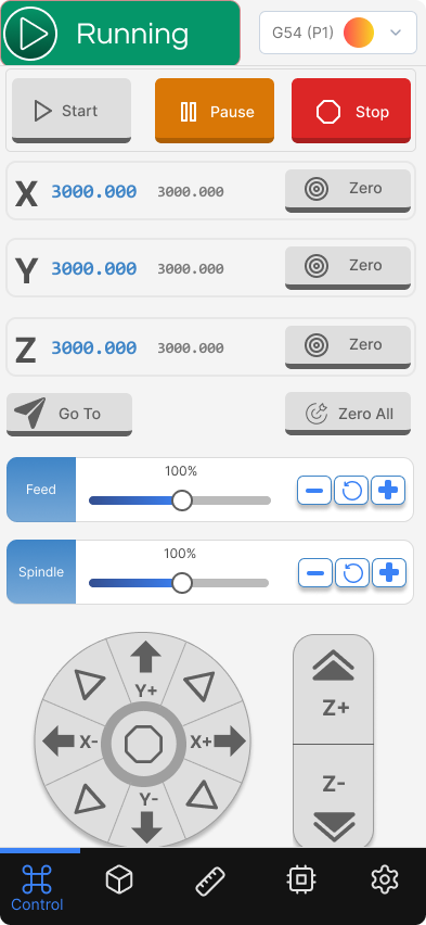
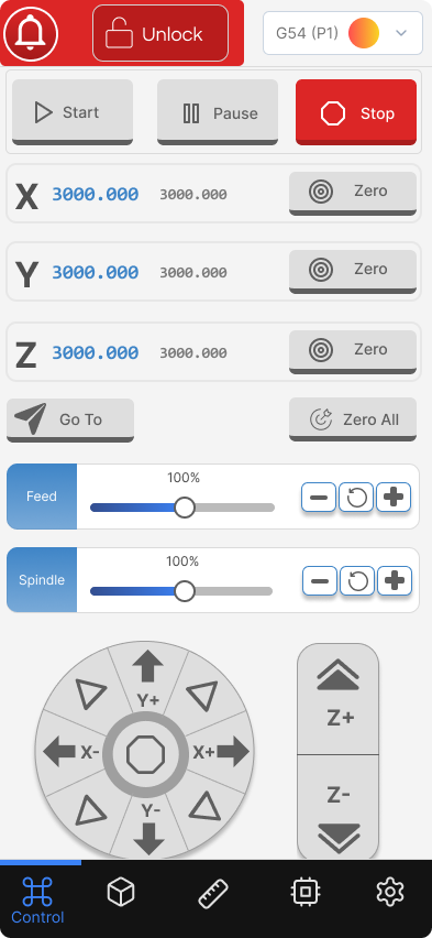
Treatment 1:

Treatment 2:
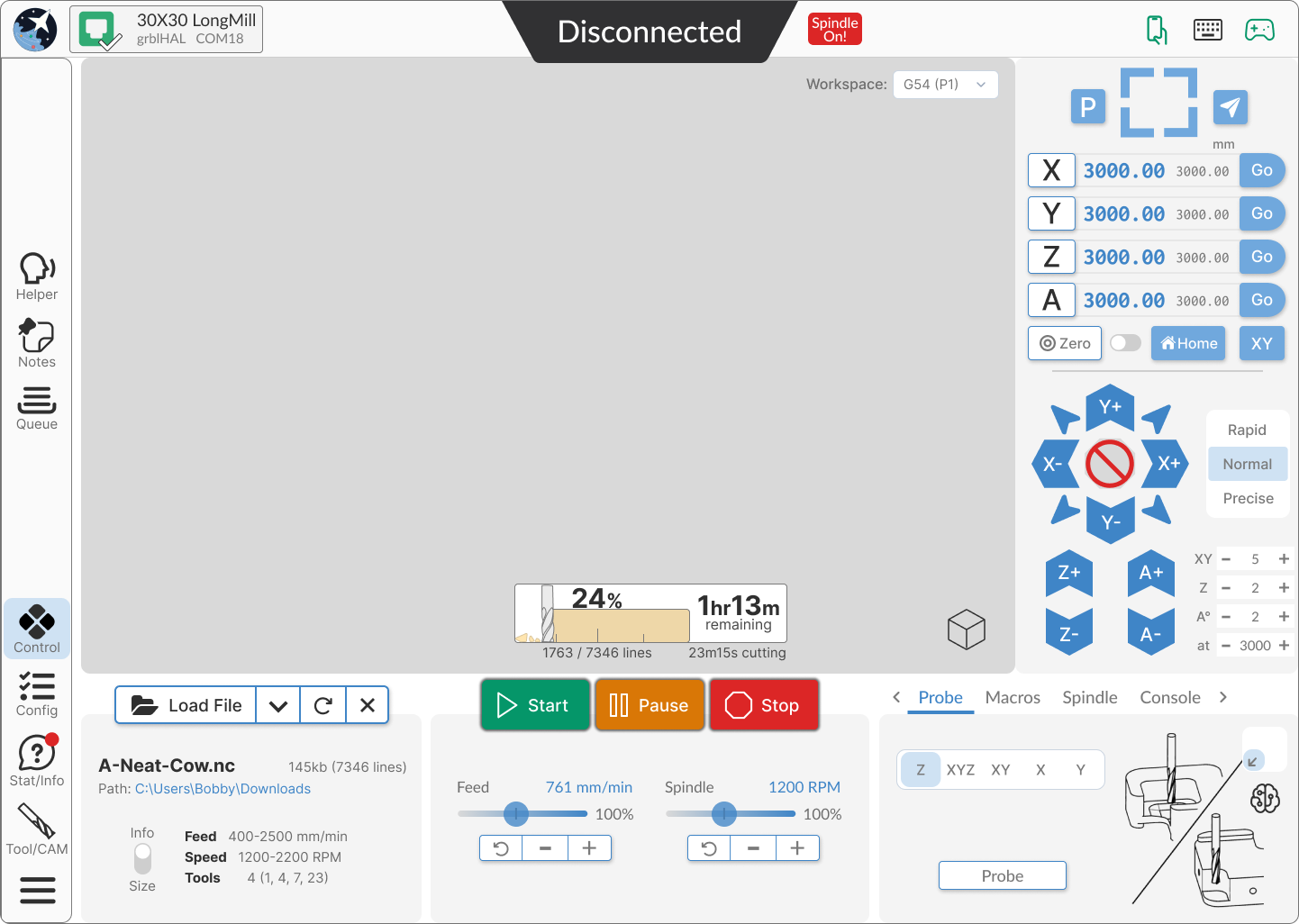
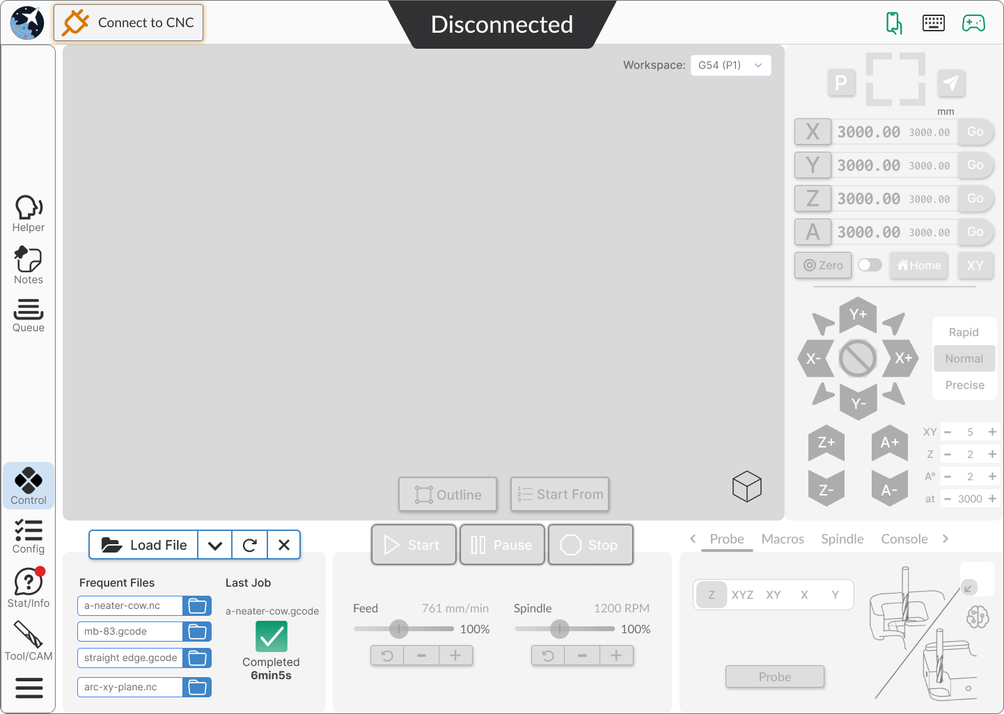
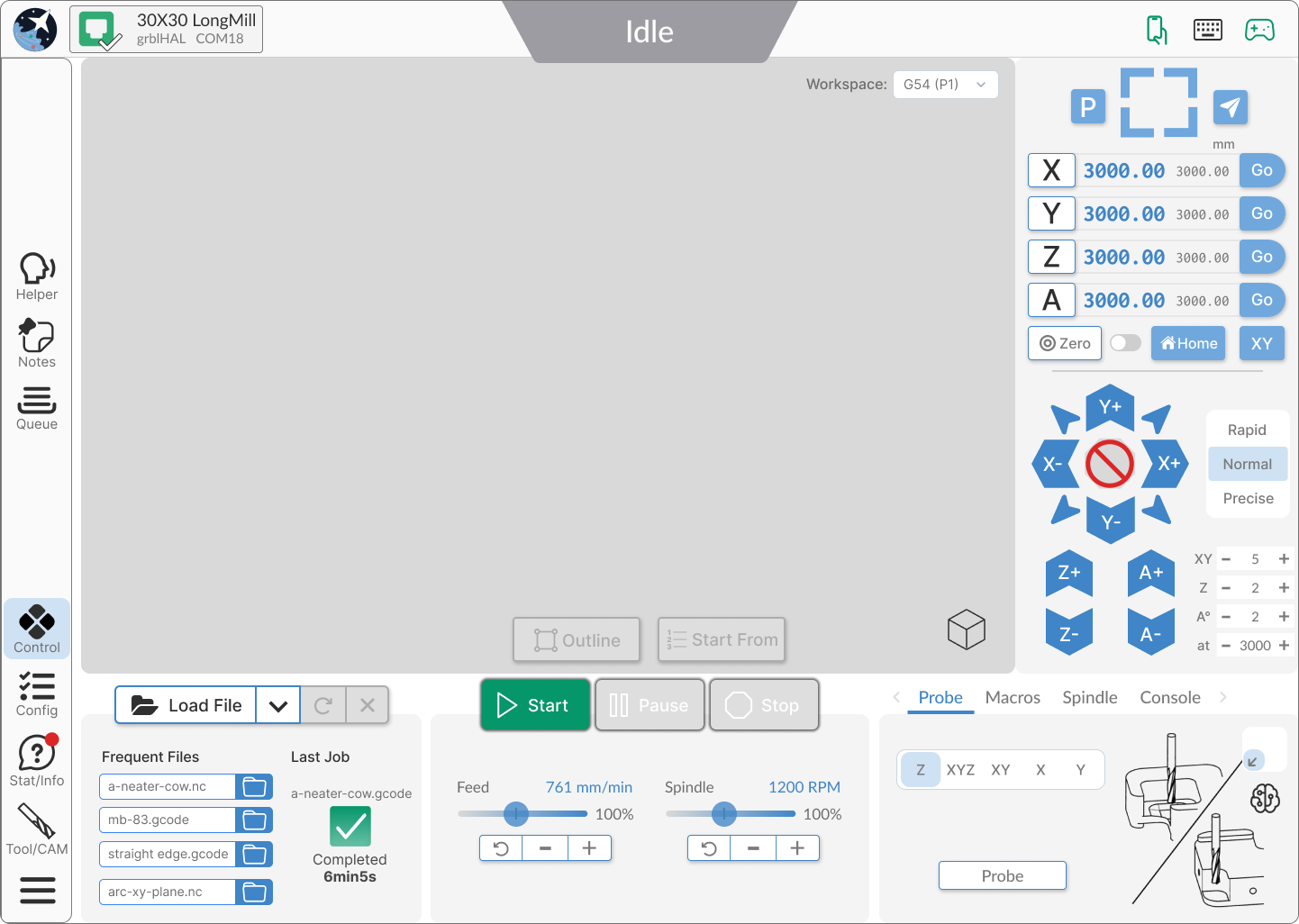
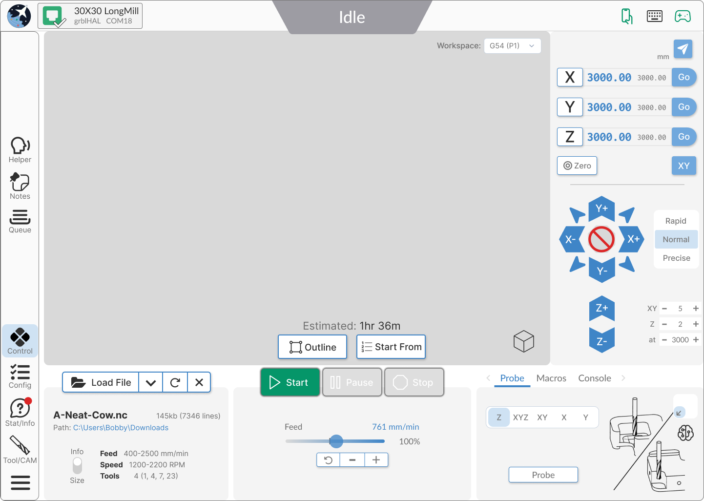
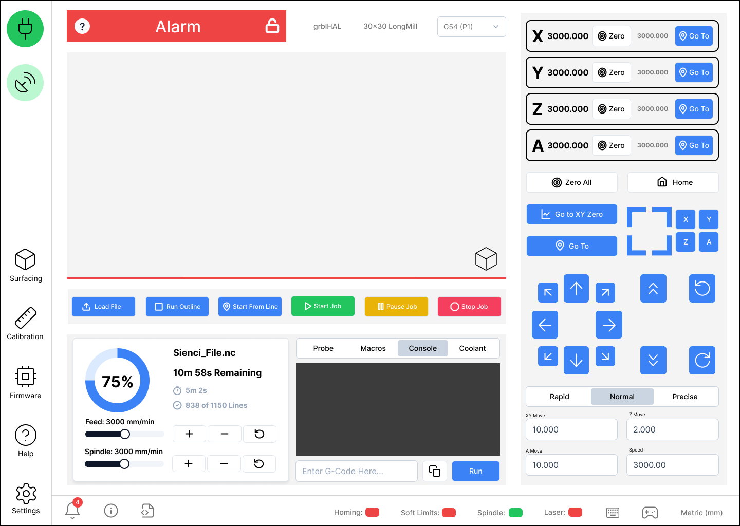
Treatment 3:
1 Like
I prefer Treatment #1.
Treatment #2 is so, so.
Treatment #3 is too busy/distracting.
1 Like
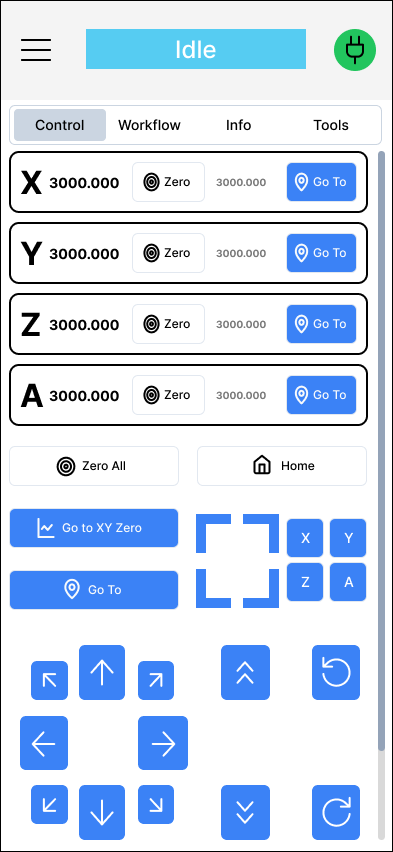
The look of Treatment 1 is open and clean. More importantly, from a practical use point of view, when I am jogging I am looking at the machine. Too many times, due to interface design, my mouse meanders slightly as I click and something goes the wrong direction. Design one keeps the various axis separate enough to help avoid this. Although it may not look as cool as the circle design, it is safer. I would even push the corner buttons, the combined xy jogs farther out to leave slightly more space between. Not as cool as the inset corner buttons, but safer for function. Space between these buttons is really important.
My 2¢.
1 Like
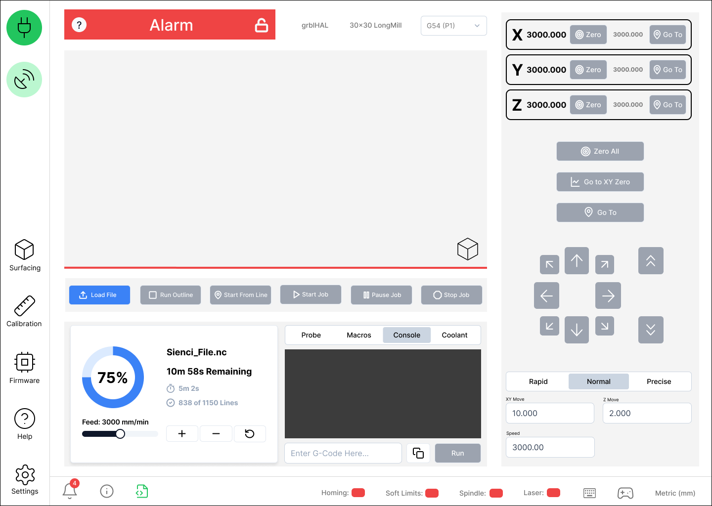
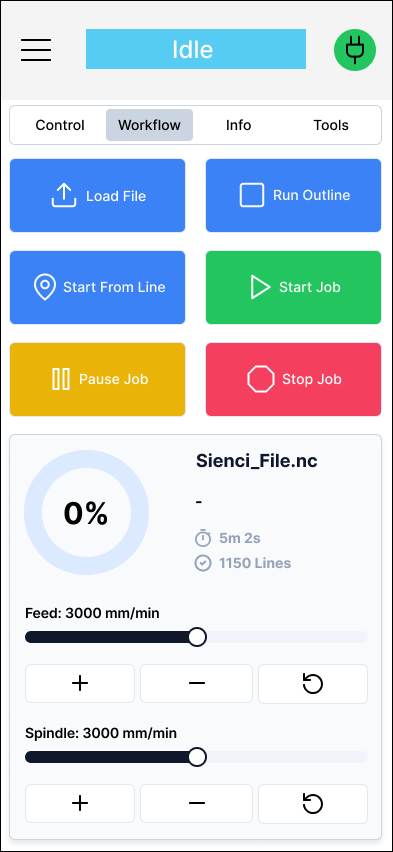
I would very much appreciate if the job stop button always occupies the exact position on the job start button and never moves. In other words you only ever see one or the ither. In this way, if I start a job and see something is wrong, I can immediately stop the job with a click, not needing to look away from the table to find the stop button and reposition the mouse. Those seconds can be precious. OMAX does this in their control software and it’s great.
5 Likes
Probably prefer Treatment 1 also although I do like the File Notes pane options shown for treatment 2. As an aside, I recognize that you can’t easily include the Visualizer in the mock-ups but it would be really nice if any customizations applied to the Visualizer were persisted across sessions. Currently, changes are saved to the Settings but are not reloaded (or at least not all of the customizations are reloaded) with a new session. Additionally, a g-code editing pane would be handy.
I really like the colours and finish of Treatment 3 but I don’t like the round Jogging buttons thingy. I prefer the orignal Jogging buttons. I don’t see the point of using up real estate to display the ‘Recent files’ that were run. The single last Job with it’s stats is more than enough and even then, that could possibly be displayed on a different tab than the main one. Maybe Treatment 2 is my preference (??)
That being said, I agree with a few of the other posters that things shouldn’t be changed just for the sake of changing them. Maybe just freshen them up a bit and tweak a few things (like separating the Goto and Zero buttons for each axis).
1 Like
I totally agree with R.Portman. No. 1 best choice.
I like transition 3 and I would still like to see workspace selection to be lockable so it can’t change or revert back to position 1 without resetting the hole system or physically telling it to change, it will make it easier when your working multiple work spaces.
I like treatment 2 the best. But I would like to see the “console” area be more prominent when it is being used. And what happened to the “Spindle/Laser” selection?
I like the Layout of 1 or 2. Both are intuitive to look at and would be easy to navigate to me. I havn’t looked at a G Sender for I think 2 years or more. I could tell what everything is or should be. Nice work Chris.
I like the layout of #2 , looks easier to navigate while still being familiar to the original.
1 Like
I preferred treatment 2, but I would like to see colors on direction buttons for each axes, like X could be magenta, Y pink, Z purple etc.. to make them pop up because they are important and would be easier to related color to axes.
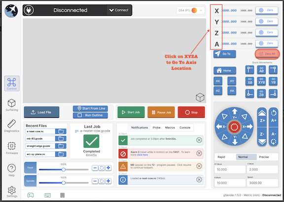
See picture for info.
Thanks
My 2-cents on the topic;
- Treatment 2 and 3 are a significant improvement over current, with the layouts as shown that suggests 3 is better - small visualiser area for a smaller screen. That’s the only reason for preferring 3 over 2.
- I like the A-Axis controls being on the front ‘page’ - my CNC is permanent 4-axis
- I have always felt the probe graphics are too large for the given space on the tab
- I have always felt the ‘goto’ and ‘zero’ buttons are too close together - a stray click and zeros have to be re-established
- I have limited screen resolution (MacAir 1400x900 or 1380x860 with ext. display), so would like to see the Visualiser area shrink more than it does currently, to ensure all controls remain visible
- I don’t use headless mode, so can’t really comment on that
- Add my voice to including 3D probe functionality - I use one with a suite of self-made macros for corner, top and circle/shaft centre finding. Height mapping might be nice (marginal pref), if HAL can compensate with it, or if it could be uploaded back from gSender for other app use (Vectric & Fusion being my main tools)
- The latest Creality Print app has a ‘more accurate time estimation’ option. Would be nice here…
- Some sender apps have the ability to re-size, or move blocks of screen around. Not a substitute for good layout design, but might help edge case users gain the layout they need
I am a relatively new user of gSender. I found the current design superior to other senders that I have tried. That being said, I would like to see the jogging controls to be as large as possible. I typically just use a wireless mouse for jogging and from 6’ away the buttons are on on the small side. Maybe a popup that expands the size? I like the informational popups of treatment #2. It keeps the screen uncluttered but provides quick access if needed.
Treatment 3, but include easy link to “Go To” without additional buttons. The letters are the intuitive buttons.
The “Zero All” button is dangerously easy to get to.
I prefer treatment #2. It keeps some of the design elements we already are familiar with (jogging) but with better overall layout and use of space. The only thing I prefer from treatment #1 or #3 is the progress indicator widget. The new solution in treatment #2 is too muted and difficult to see from a distance in the shop. I will often look at the screen for other areas in the shop to check on progress so the larger indicator is useful.
You can set start/stop commands to remember the workspace you’re using. (program start = %global.state.workspace=modal.wcs, program end = [global.state.workspace])