I prefer option #1 (=current design). I think the new treatments try to give visual weight to too many things and it begins to be hard-to-understand. My eye does not know where to go and thus it feels confusing. Some of the ideas, like adjusting the feed rate and spindel speed certainly are big bonuses! And surely making sure that the UI scales to different screen sizes is important. I use the software on a screen with 1280x1024 pixels, so normal desktop view is one I use.
1 Like
I like treatments 2 and 3.
I like the color and the layouts.
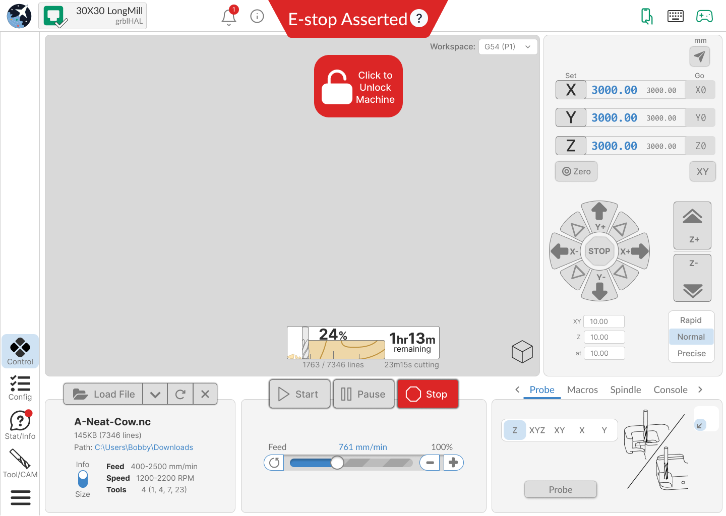
Still like Version 3 however am a bit concerned about loss of visualizer size. Maybe a reduction in the amount of vertical space the notification center occupies could allow for a bit more vertical height for the visualizer.
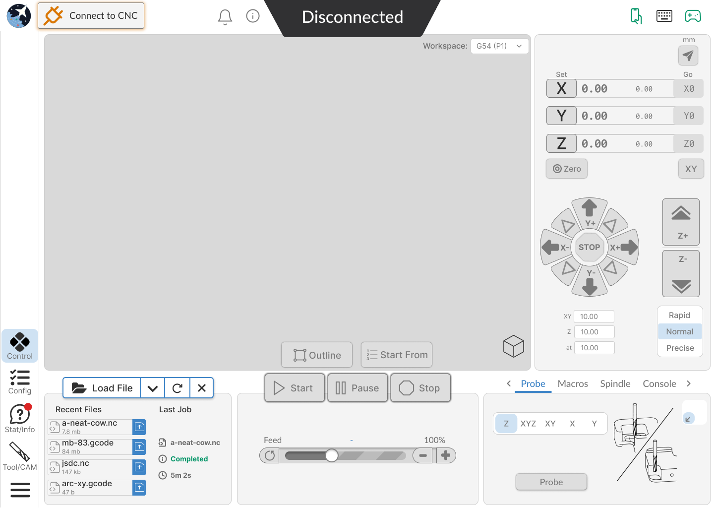
With regards to Version (Treatment) 3 I prefer screens 2 & 4 with regards to disconnected & connected modes.
I prefer Treatment 3, but hope that the console (and perhaps the other features with console) have the ability to “pop out” to show a larger console window. It is a little busy, but I think, as long as items are logically arranged, it’ll work well.
I prefer Treatment 3.
I prefer #2.
The overall layout is clean and easy to figure out.
Treatment number 1 is the nicest in my opinion, this with the option to customize some colors would be more than enough
I would appreciate clearer delineation between what belongs in gSender vs what should be elsewhere (e.g., in the post processor or SLB).
There have been comments in the past that MPG pendants shouldn’t be supported in gSender because GRBL doesn’t really support it. But gSender supports jogging via onscreen buttons or joysticks or whatever. Pick one and be clear about why you’re supporting or not. Why are we fussing at all about onscreen jogging widget layouts when easy-to-integrate HID compatible USB MPGs can be had for <$100, and regular ones (if you want to plug directly to the controller) for less than that?
Should the spoil board facing function be in gSender directly, or should there be a secondary app that generates a spoil board facing tool path from an optimized UI? Again, is this part of a focused tool or was it thrown in because it was easy to do at the time? It’s weird that this is a “homescreen” button/tab in gSender. How often do you expect us to press it? How often is your analytics showing that we press it? Am I not refacing my spoilboard enough?!? ![]()
The tool change functionality is really opaque as well, and it’s not clear at all what should be in the CAM post processor, gSender, or again supported directly via the controller. It’s maddening that it’s not possible to manually trigger a tool change (seems like they can only be started by running a file with an M6 command in it?) to validate or debug the process - I don’t want to learn how this works after I’ve already run a path, I want to learn how it works one step at a time in a controlled environment. Where is “tool change home” relative to the machine home, or the probe location? Nobody knows!
I understand that it’s a hard balance to hit between the capabilities of a “home use” controller that is feature limited due to costs (and therefore more functionality ends up getting stuffed into what is purported to be a simple “sender”), and needing readily accessible configuration functionality for those of us who are typically doing more unique or one-off setups than a production environment which has a more rinse-and-repeat nature to it coupled with more capable machine controllers.
Thanks so much for considering!
2 Likes
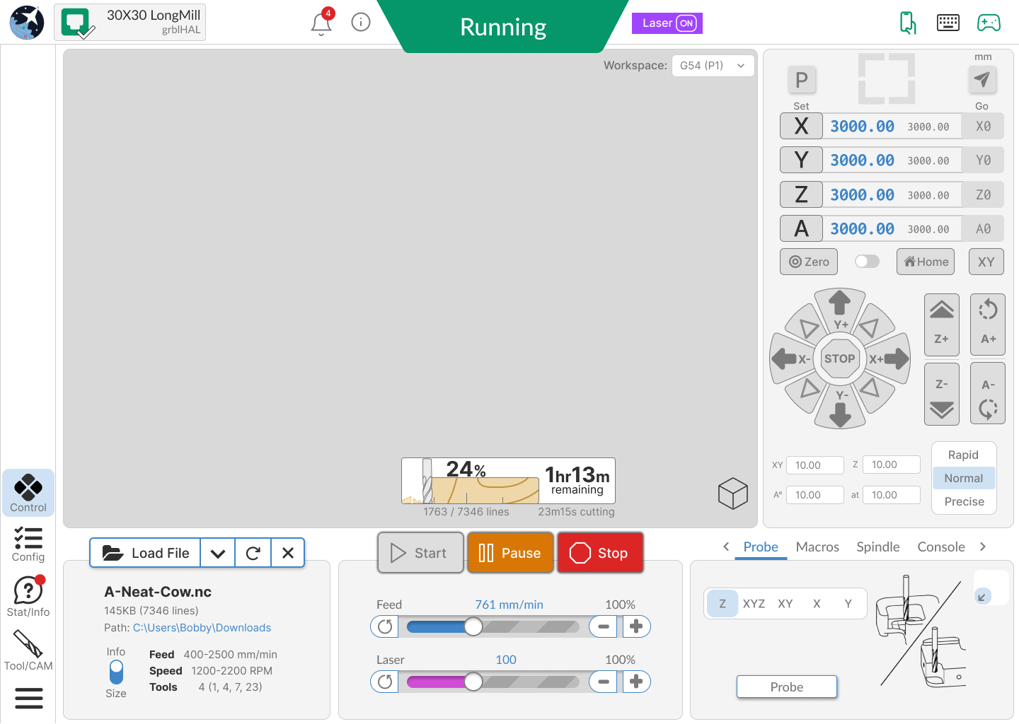
Something that came up today. It would be nice to have program start and stop events for normal work vs Vortex. I have to go in and edit my stop code every time I change modes. Forgetting happens ![]()
That’s a good idea. I’ve even thought that maybe we update the start/stop/pause/resume events so that based on the accessories you’re using, they update to do the appropriate things. I like your idea too of having them happen based on what’s turned on and off. This isn’t really UI related but I’ll still note it down, the only hard part would be figuring out how to implement it so it doesn’t become too large or confusing if you have code snippets for laser, spindle, vortex, etc.
Hey folks,
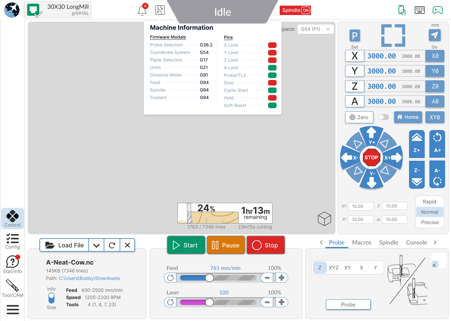
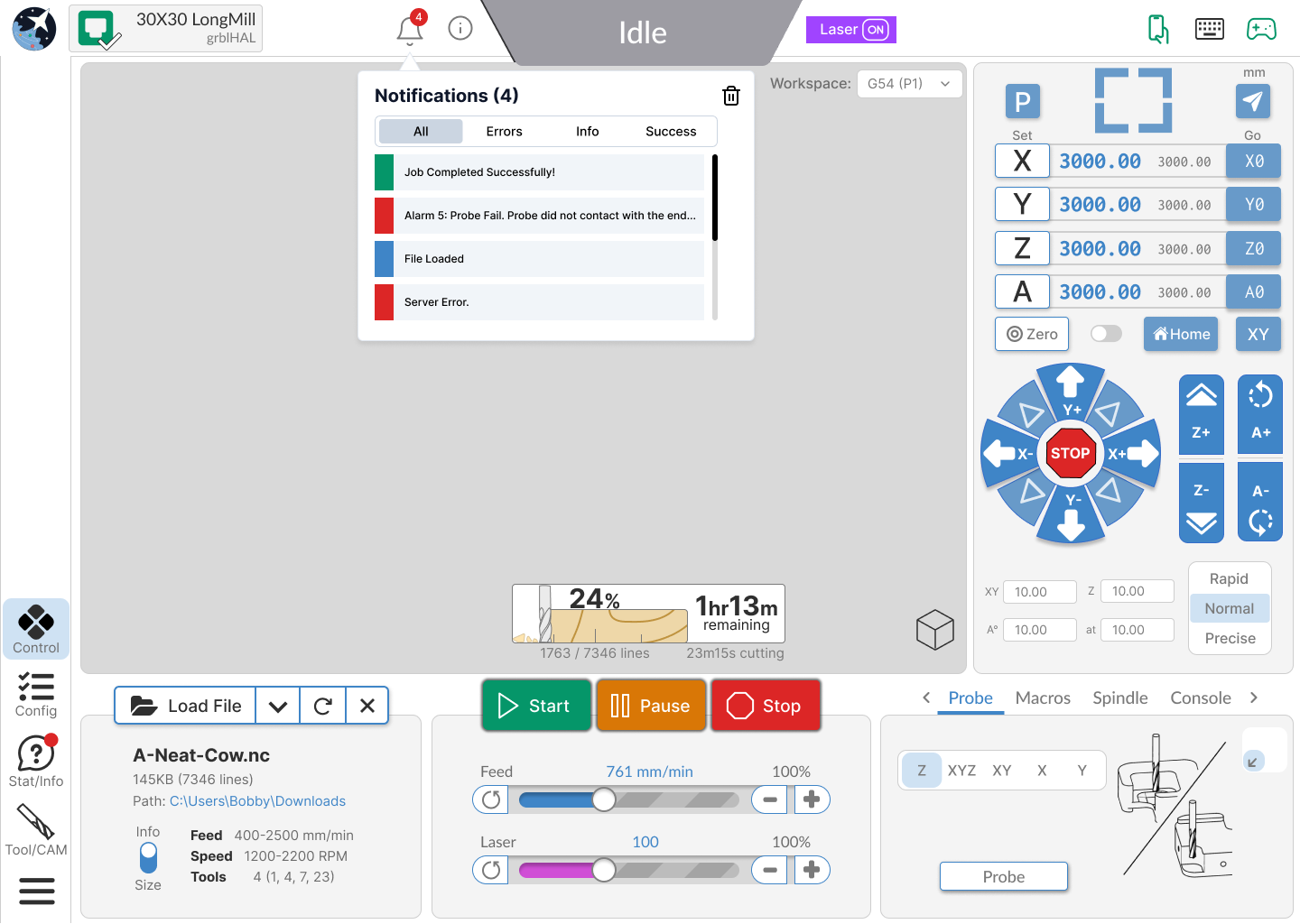
Thought I’d pop in to share some of our thoughts and progress. Below is the direction we’re leaning - the overall layout of the application should be similar and familiar to current users with some hopeful improvements to other areas that have been mentioned internally and in your feedback. We’ve broken down the application into a few common states - basic (out of the box, no features on), advanced (all optional features/accessories on) and some mobile and landscape treatments. We’ve also included some informational popouts/hover elements so you get an idea of the information contained.
If there’s specific point you still think are troublesome or you have general feedback/pain points we’ll continue to iterate over the coming few weeks. That said, in general we’re happy with the overall flow of the application and are working to touch up some of the rougher elements.
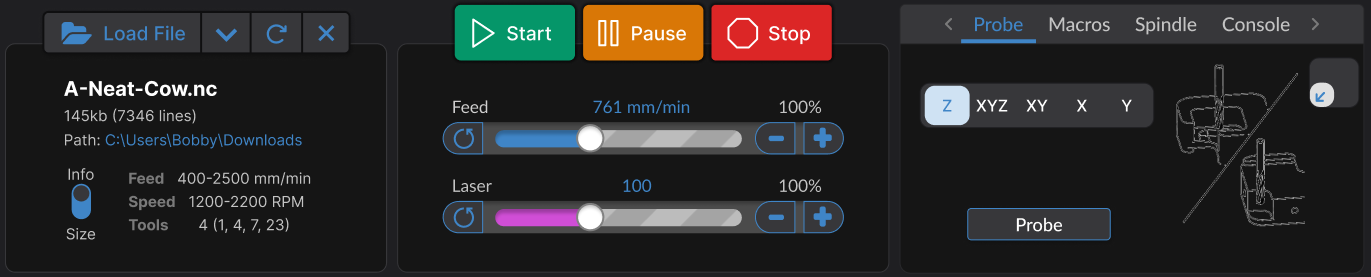
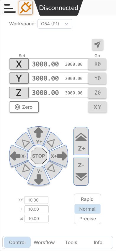
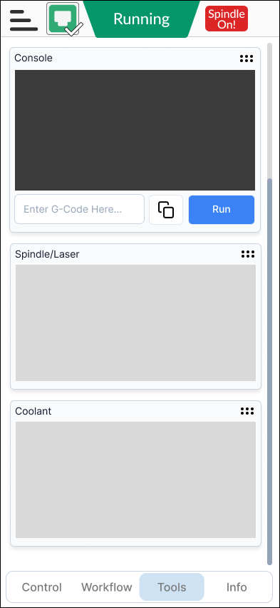
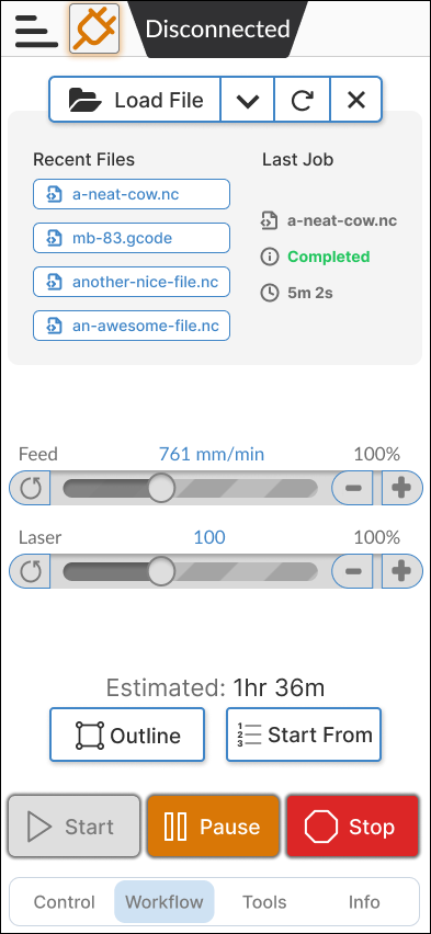
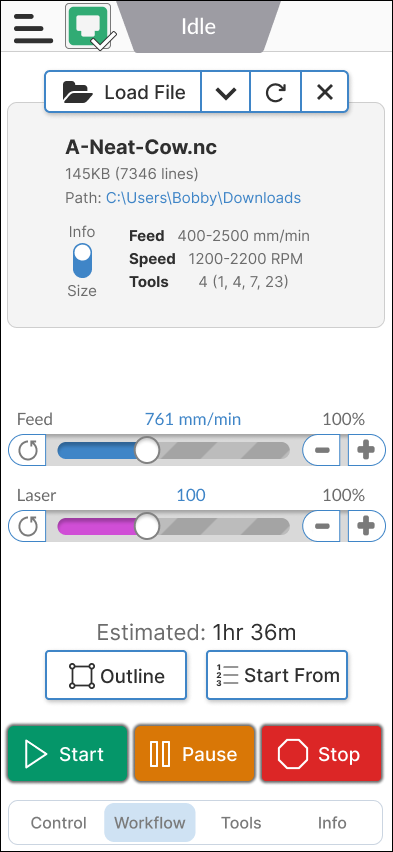
Basic
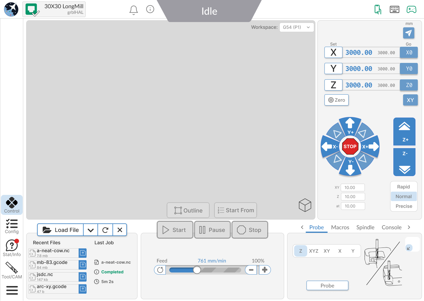
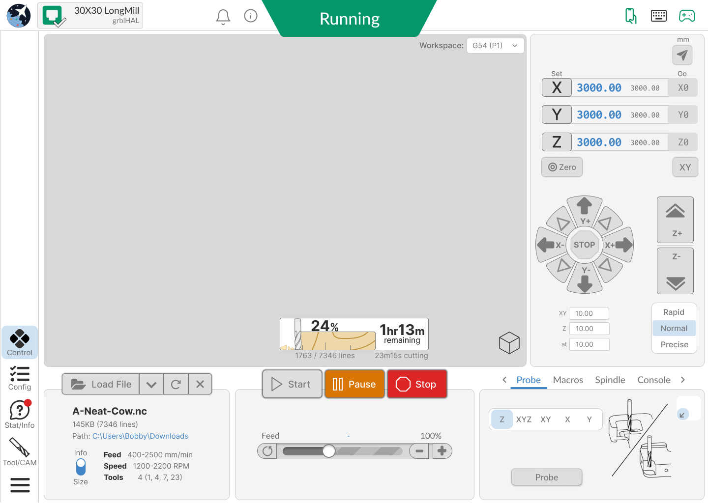

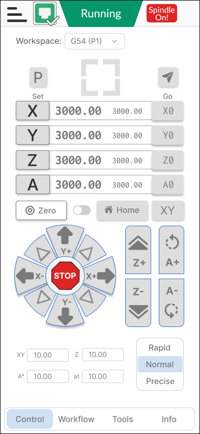
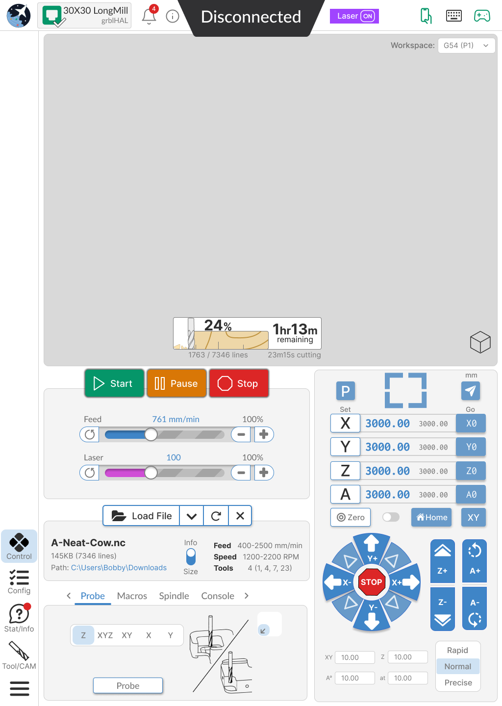
Advanced
Popouts
Mobile


Landscape
2 Likes
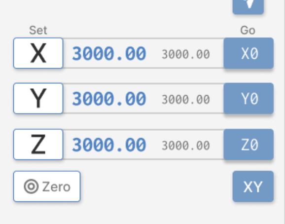
@KGN Please explain how this section operates.
1 Like
I think it looks good. I’m sure in 3 to 4 runs I’ll get the hang of it.
A few questions/comments:
- Please have a color-blind person give input. Might be some colors that work better together than others.
- Will there be tool tips? I think those go a long way to help folks figure out how things work (like that icon in the upper right – is that a millimeters/inch selector?)
- Can you pop out the console to a larger window?
Will these probable changes be suitable for plain old gSender or only gSender Edge?
Are they suitable for grbl or only grblHal?
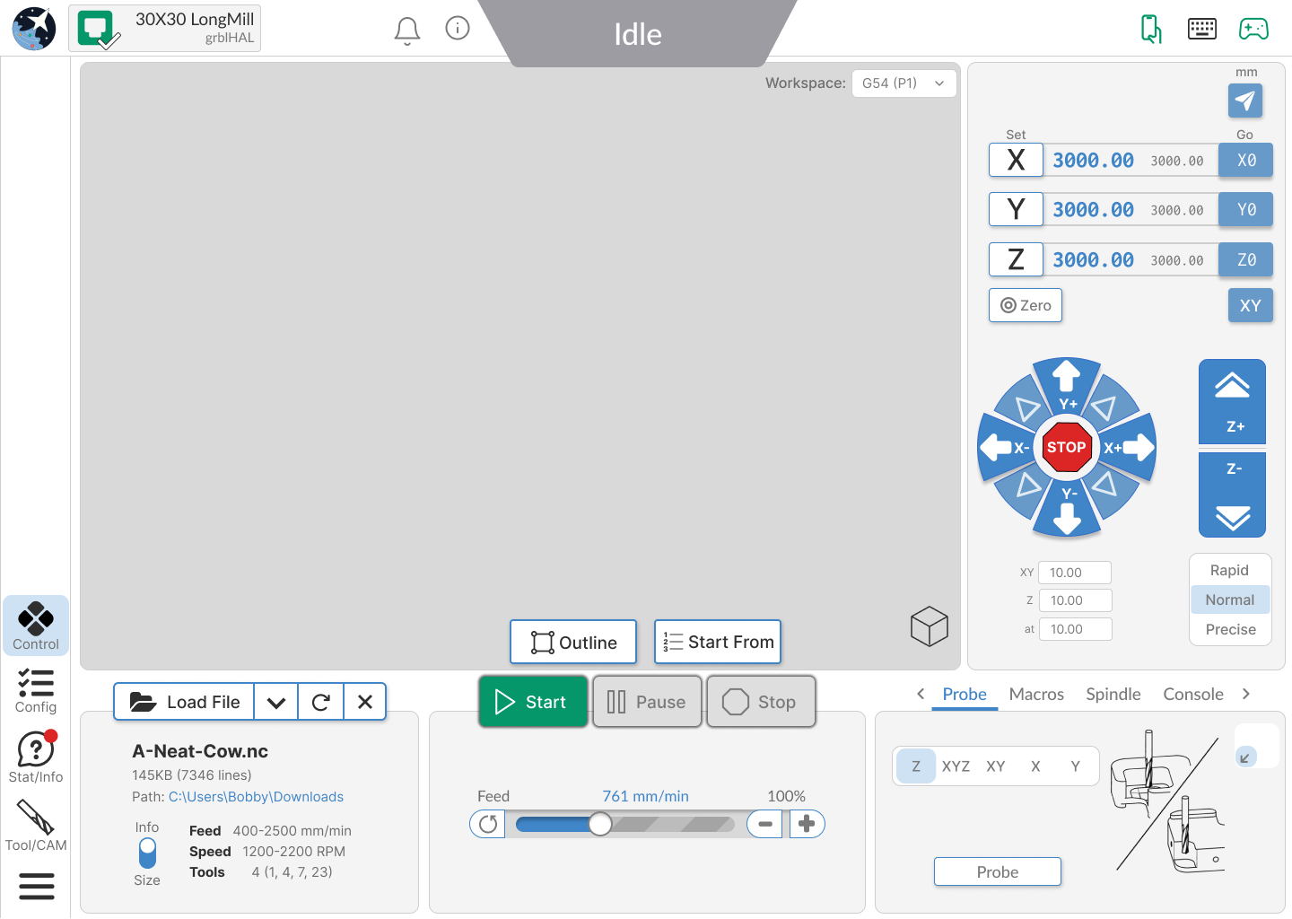
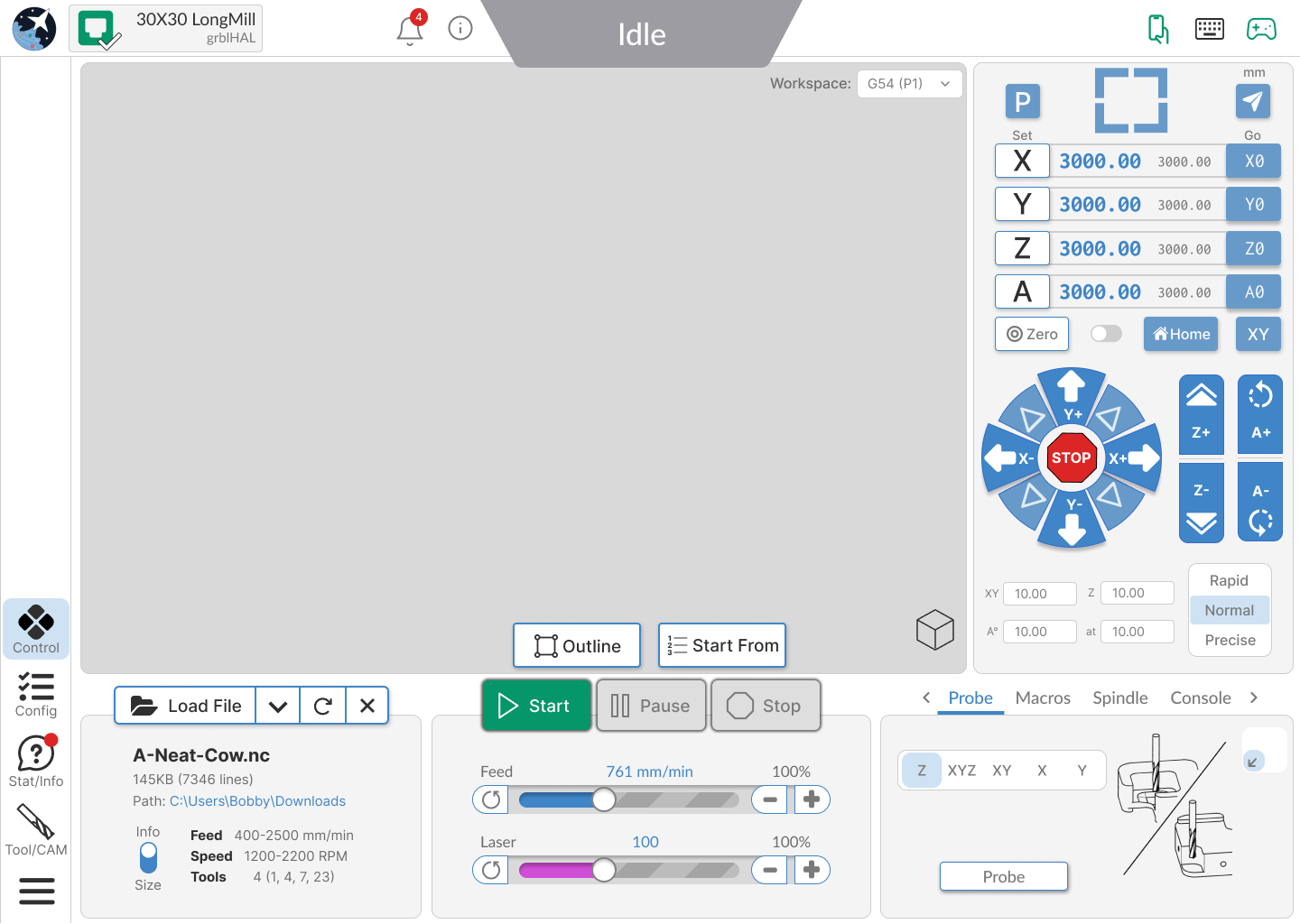
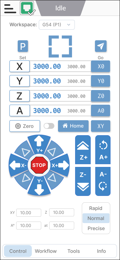
- The white axis buttons on the left are for setting your zeros
- The blue buttons on the right are for going to axis zero
- The individual white zero button with a target icon zeros all the axes
- The blue button with the XY label goes to XY zero
Hope this was clear enough, let me know if you are still unsure about how that section works ![]()
We are taking into account accessibility when we start developing this new UI, color schemes is still something we’re thinking about.
Yes, there will be tooltips for many icons and other components in this new UI as I think they’re a handy feature to have.
Yes, we have this feature on the latest version of gSender (v1.4.7) and intend to keep it and have it working on the new UI update ![]()
1 Like
We will be rolling out this new UI update on gSender Edge to start with so we can gather more feedback and also fix any bugs that come up.
Once we are confident with its look and feel as well as its stability we intend to push it to the main version of gSender and off of Edge so the majority of users get to experience the new and improved UI.
This new UI was designed to work well with any firmware type that we support, which includes both grbl and grblHAL.
Hope these answer your questions ![]()
8 posts were split to a new topic: Thoughts on gSender Surfacing Tool
So is the latest version 1.4.7 for Edge or for standard gSender or for both?
@Lappa Version 1.4.7 is gSender. Take a look at @walid_kayhan post above. He explains how Edge and gSender relate. This has been the process since Edge was first introducted. The most recent version of Edge is 1.3.10, released in December 2023.