I asked because the above post you refer to didn’t contain version numbers for gSender or Edge so I was unsure what or which program V1.4.7 referred to.
Which program, EDGE or plain gSender, do you believe is the most used program?
Thanks
@Lappa I would assume that gSender is the more used of the two. Edge is the “beta” version. Although, at some time during the cycle, it will contain features that gSender does not, many users may be wary of being “beta testers”.
That said, right now, gSender is more feature-rich than Edge since gSender has been frequently updated to accommodate new hardware such as the Vortex and the SLB, and to run under grbl-hal.
When the new and improved Edge is released, we will be back to what was the norm. That is, Edge will have the latest features. As @walid_kayhan posted, when those features have been sufficiently tested and tweaked in the real world, they will be rolled into gSender.
Having read what I just posted, I want to be clear on one thing. I do not speak for Scienci. I can only relate on how the process has worked since Edge came into being. I am reasonably confident that what i am saying is accurate, though, again given Walid’s post.
1 Like
Here’s my feedback (annotated images as well):
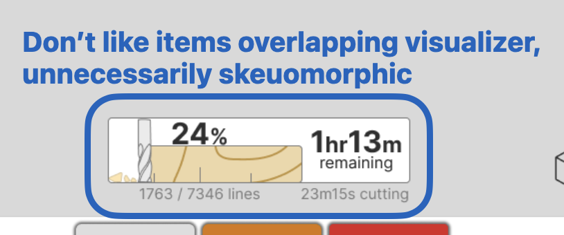
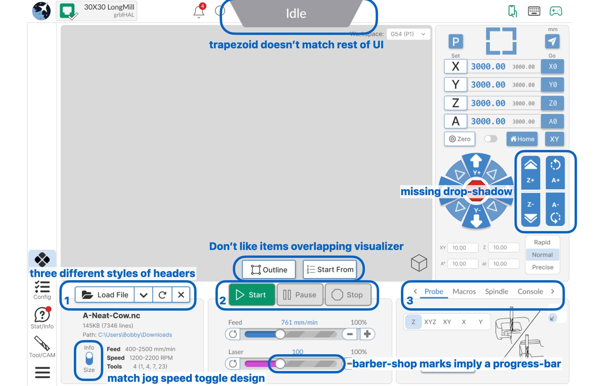
• I really don’t like items overlapping the visualizer, and I’m not a fan of the “progress plywood.”
• The status trapezoid doesn’t really match any other icon, I’d make it a big rounded rectangle like other icons, or integrate with the machine box that says “30x30 Longmill”
• The Z axis and A axis jogs are missing drop-shadow, but I imagine this is still a WIP.
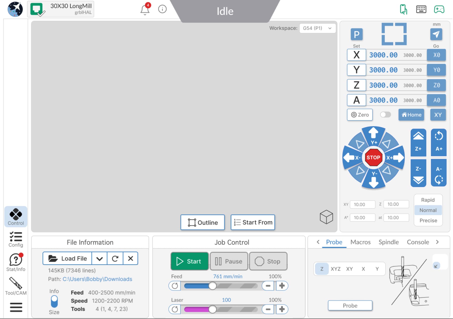
• There’s three different style of headers - I think they’d benefit from more consistency. I also think headers 1 & 2 should be inside the boxes since they are controls within those sections, while header 3 selects between windows for that section. My 3rd image has an alternate concept (I recognize I cut off the file name, I would adjust box layout or shrink visualizer ever so slightly, I didn’t quite get the fonts right but hope you get the idea).
• I don’t like outline/start from sitting up in the visualizer, they seem more at home within File Info or Job Control.
• I think having probe, macros, spindle, and console all in one box is a lot. It could be possible to combine File Info & Job control (ensuring all controls are always accessible) to give space for another section (maybe even give the user customization over what items are in that box?
• For the info/size toggle, I’d try to match its style to the jog speed toggle.
• I don’t really like the feed override sliders, they look like progress bars. Maybe have some indicators for max/min to give a sense of scale? If you drag it around now you need to watch the percent value change, but you could put tick marks from 0-200% and make it like a thermometer.
4 Likes
Is there a potential to have a small timer shown on the interface with the total run time?
I like that gsender tracks finished jobs to track maintenance schedules but it would be nice if this total time was seen without having to go look in menus for it.
Thanks for considering this thought.
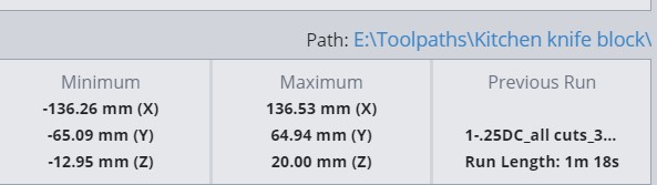
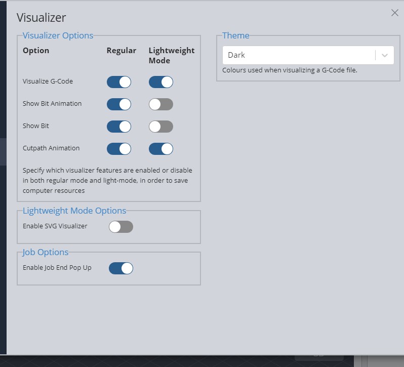
@spcnc Are you looking for something other than the one that is there now? This screencap is what appears after every toolpath/file. You can see that there is a “run length” item
Plus., if you enable job end popup, you will get a popup showing the elapsed time of the job that you just ran.
2 Likes
The interface/home screen shows the run time for the current job.
WithIn the setting there is a “Job Stats and Maintenance Reminders” screen. Each of the maintenance reminders have a total run time to the next maintenance.
What I was asking is for a clock with the cumulative run time of all previous projects since the last maintenance reminder was reset to remind about maintenance.
1 Like
Interesting idea, I’ll note it down @spcnc
1 Like
Any update on when this will be released? Haven’t heard anything in a while.
Great question! The team is actually in the midst of pushing to see if they can get the first version out sometime this week ![]() we’ll see how it goes, and plan to collect community feedback based on how it’s received then make iterations as we make our way toward December where we’d like to push it out as a Main release
we’ll see how it goes, and plan to collect community feedback based on how it’s received then make iterations as we make our way toward December where we’d like to push it out as a Main release
4 Likes
Can you _/_ please _/_ fix the double jog when using a touch screen? I know your looking at it, but it seems to be taking back seat to a lot of other options.
2 Likes
@Parkey if you’ve noticed, we haven’t put out a gSender version update since August 6 and that’s because we’re trying to put our full efforts into getting the redesign to the point that people can start using it, since it doesn’t do much good being half-done
Once it’s out, we can go back to our list of gSender bugs to fix and see what’s on the docket. The reason why the touch screen issue wasn’t yet resolved is because the last time we tried to fix it it somehow became even worse, so unfortunately it’s proven to be more complex than expected. We’re committed to get the fix done as a higher priority though because we’d like to support touch screens and potentially even look to resell some for users who want an all-in-one CNC control solution
2 Likes
Please forgive my impatience and thank you.
This new UI is looking great!!! and I for one cannot wait to try it out. Hopefully we won’t need to wait too long for the full release or for a beta version?
I also may be being stupid here; wondering why the ‘landscape’ version is called such, as portrait would seem more fitting… but I could be missing the point!
Keep up the great work Sienci dev team, as your software is leaps and bounds ahead of anything else I have used to date. Thank you ![]()
![]()
1 Like
Yeah, I’m a day late, but I was reviewing the forum: Coming from woodworking, I always referred to boards as thick x wide x long. Then I got into CNC and programmers always say X, Y, & Z. So I colored my Axes on my design program: Red, White, & Blue. Easy mnemonic.
I’ve been playing with Edge-2. The jog speed runs a max velocity regardless of the speed select buttons.
The GUI is looking better. The WS drop down is better in the upper corner, but I would prefer the use of a Radio Button control. Not sure if you can enable it, but being able to name the P position, i.e.; G55 - Job 2, G56- New Project, etc. I keep forgetting which WS I assigned to the projects I’m doing.
Toolpath speed; the plus/minus buttons work but can the slider bar also be used to make gradual changes?
Keep up the good work.
1 Like
I love the four corner buttons for parking, once I figured out that’s what they do. I had been using a Macro for park. How about labeling it with ‘Park’ in the center of it.
Also, the paper airplane button? Not good to have to click a button to find out what it does.
1 Like
I have actually been thinking about this in regular gSender for a while now. Why not allow all 4 WS to be named/aliased. If needed, a quick hover of the mouse pointer over their name could always show their ID (G55, G56, etc) in a pop up so that the space could be used for a more comprehensive/longer name.
1 Like
Another EDGE release has been made - click below to get the details!
2 Likes
i’ve tested the new edge and it looks promising, a bit confuzed to were everything was but i got my way on it. one thing i’ve niticed is, in the shortcuts the go home it’s missing.
maybe when it is added instead of multiple options you onl make one as G28 )
Sarebbe utile attribuire allo switch Spindle/laser una macro sia per la modalità Spindle che modalità laser , utile per pilotare magari un relè o altro…